Proof at shelf
Everything here is on sale in a store somewhere.
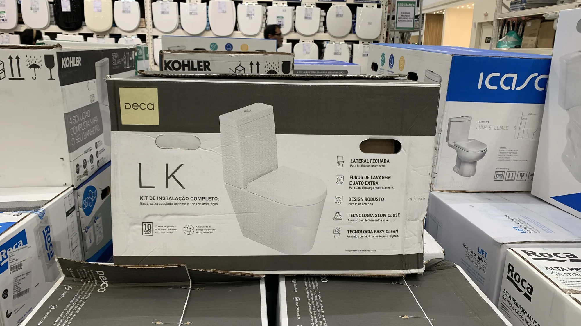
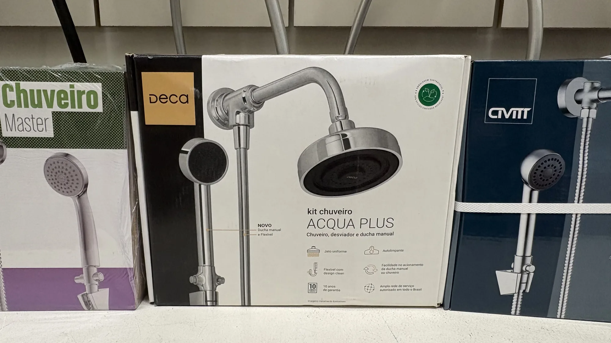
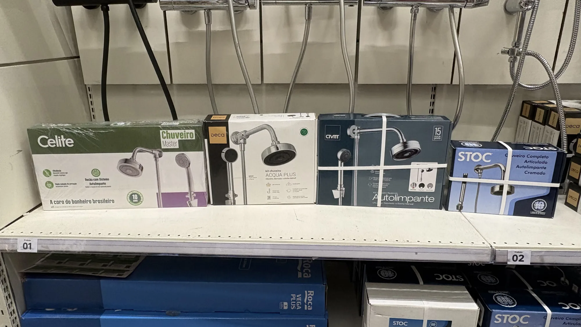
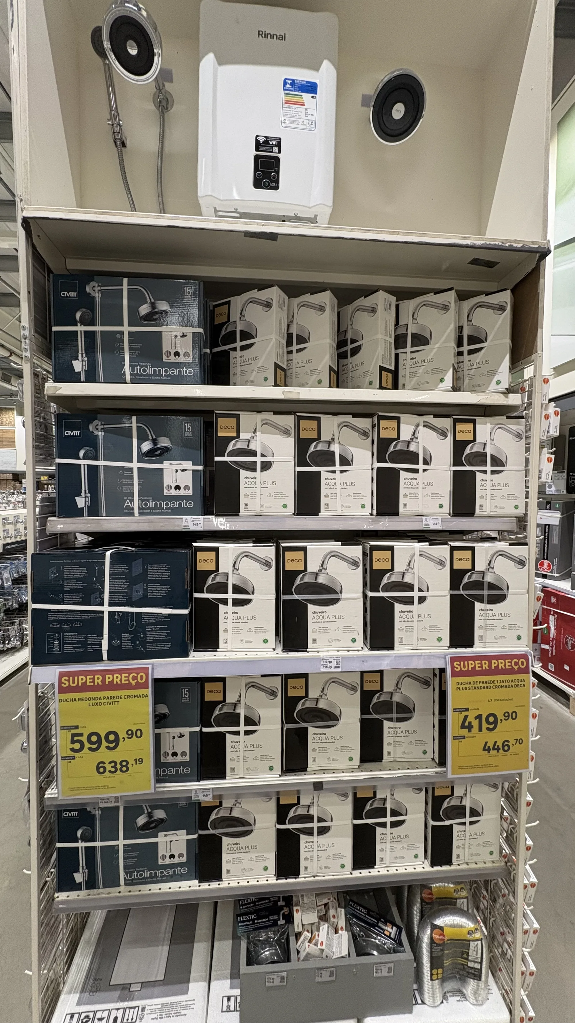
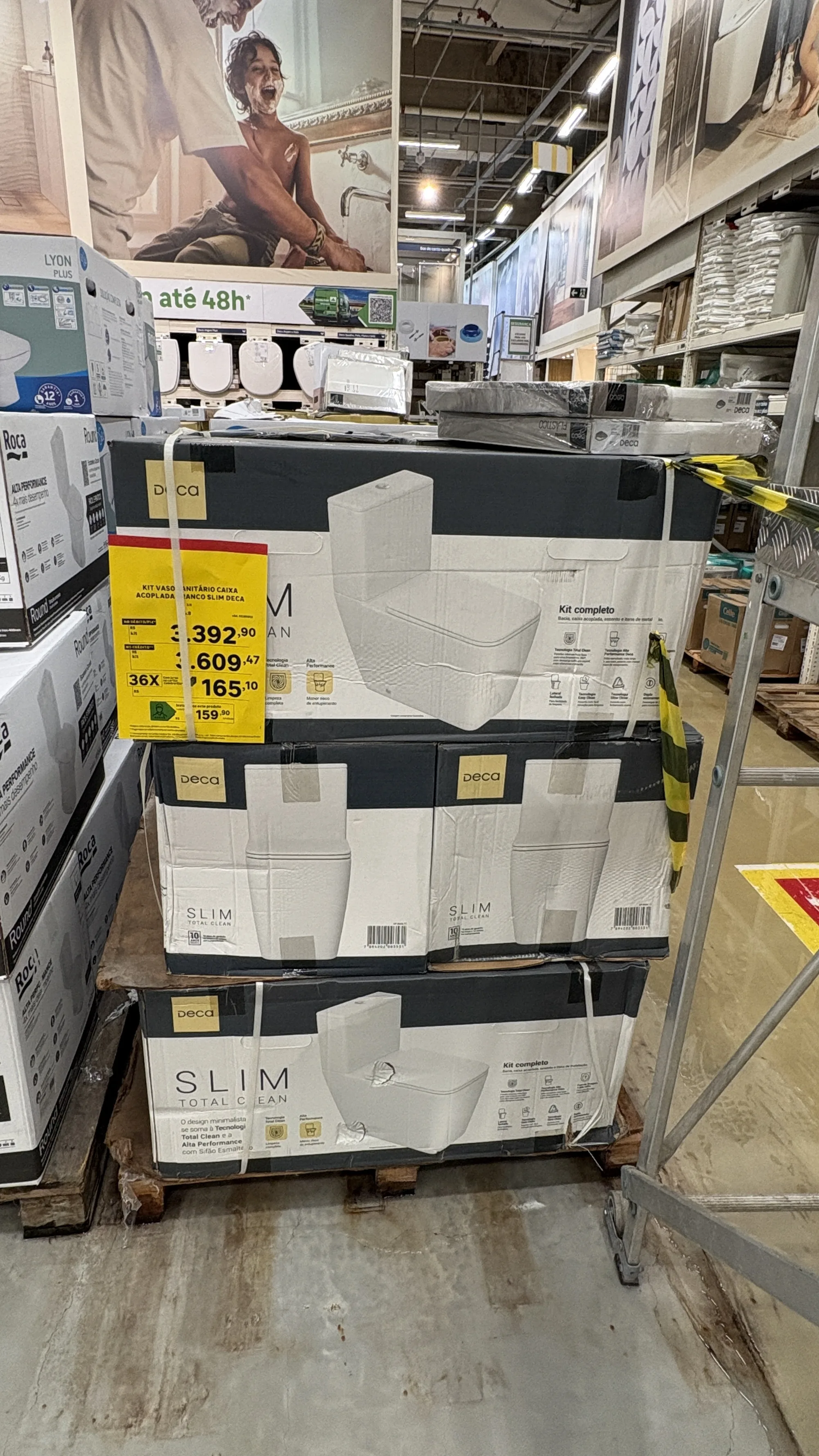
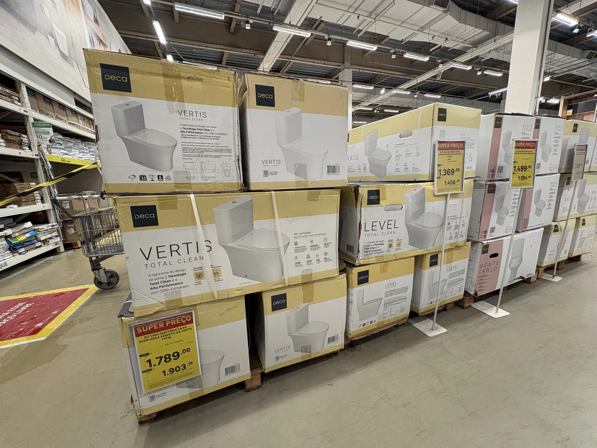
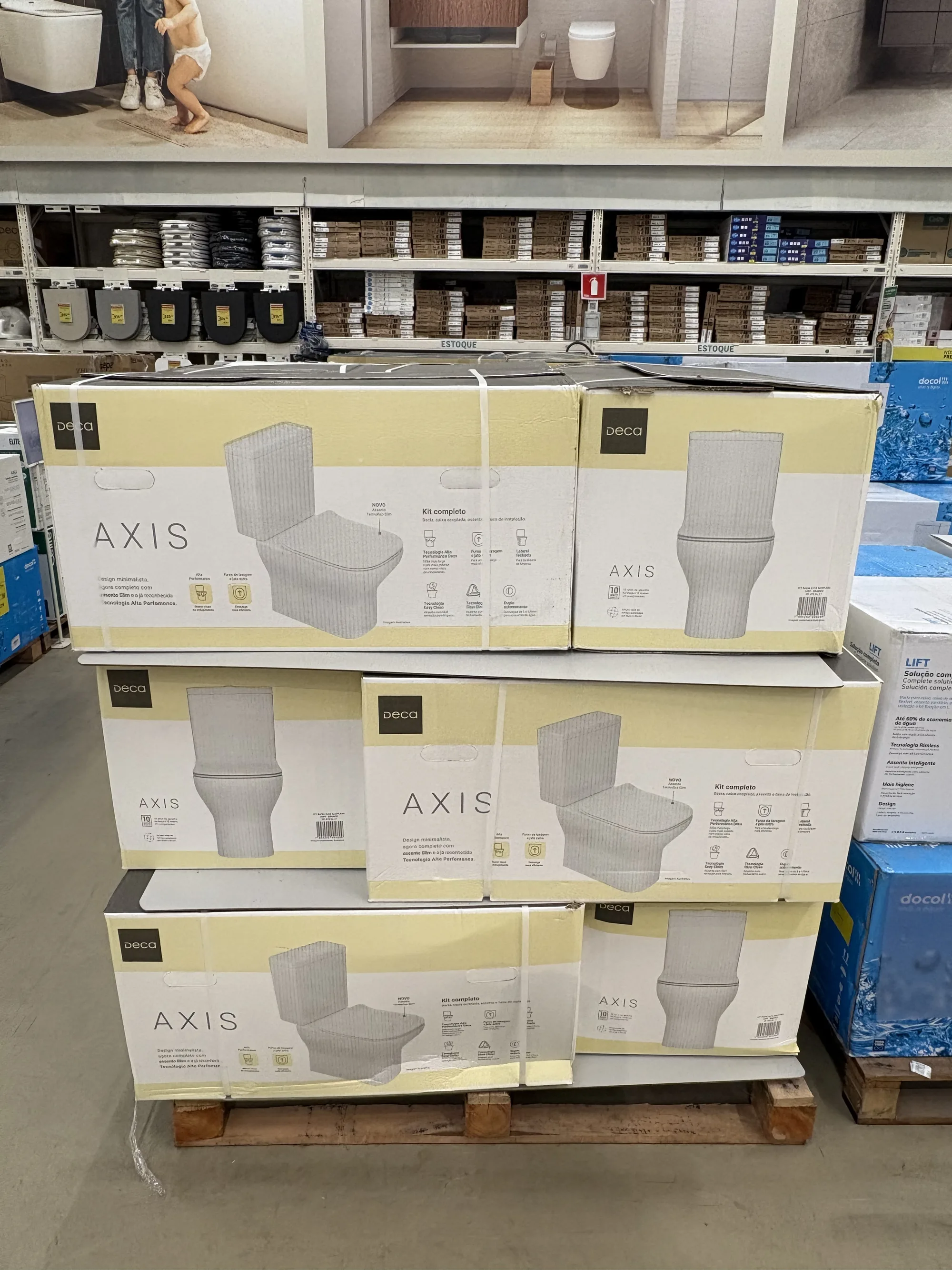
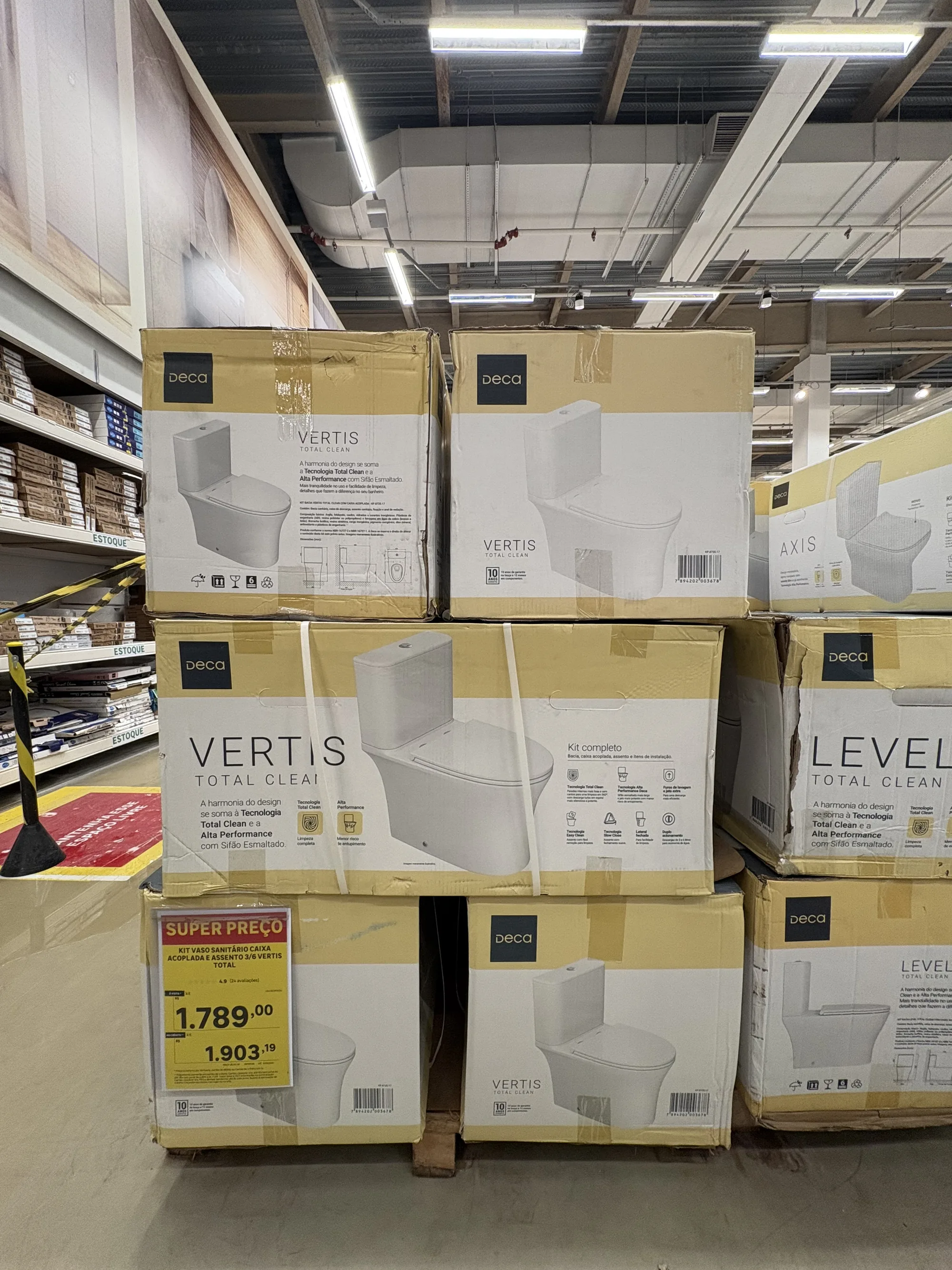
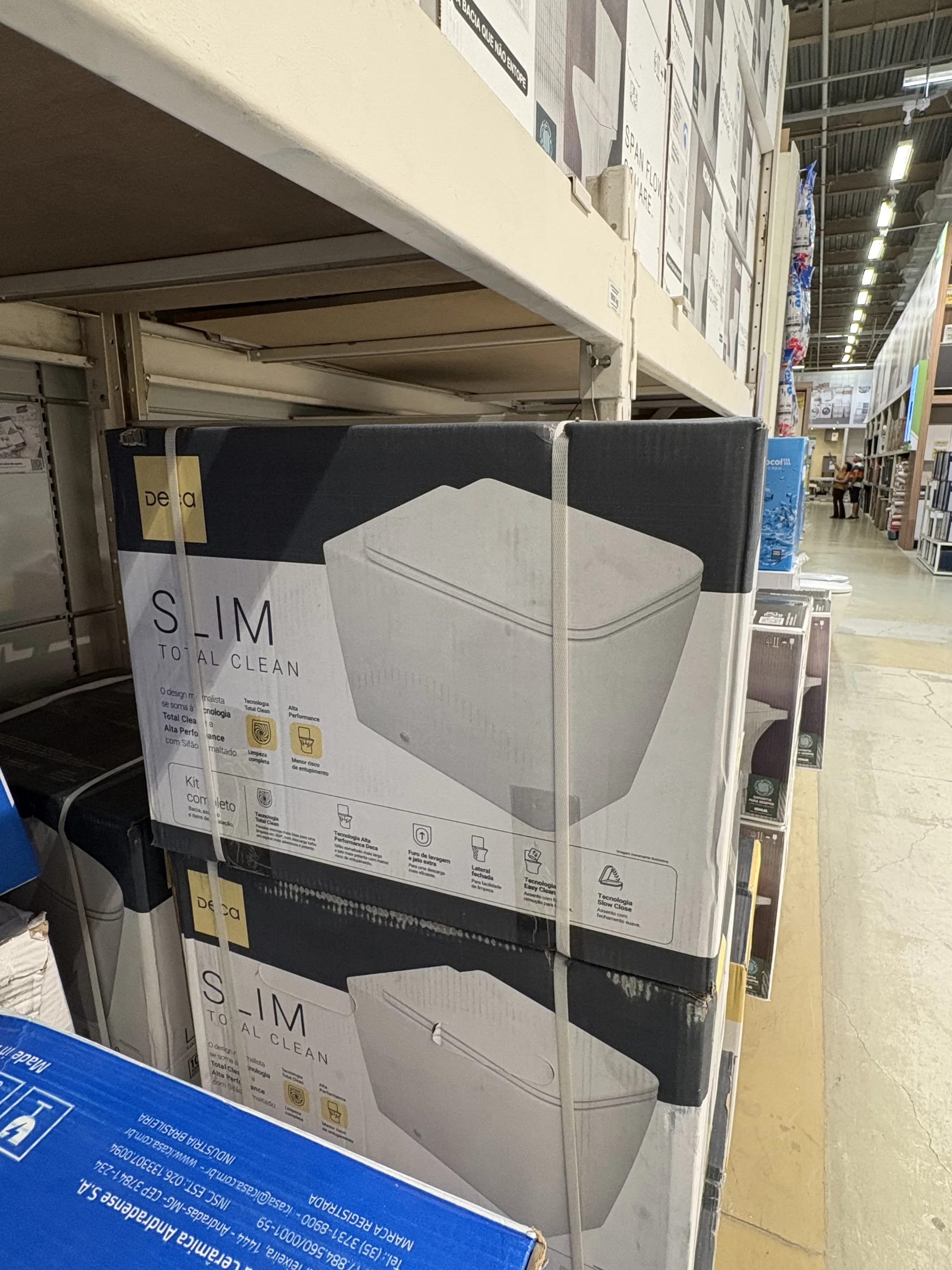
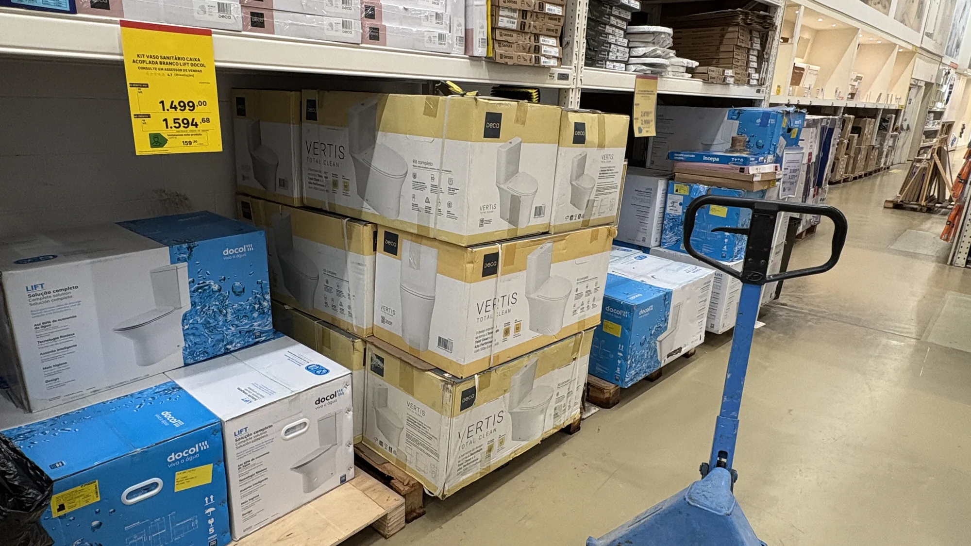
A render competes with nothing. In the store the pack fights for attention with the box leaning against it, has three seconds to explain itself and only does its job if it leaves in the trolley. These photos are that test: taken by me on my phone, at the shelf, with the light that is actually there and the crooked price tag on top. The Deca you see here is the packaging I design, produced at scale and on sale right now. The other brands are the competition, and they are in the frame on purpose: they are what my work has to beat. Click any photo to enlarge.
Photos of the packs in stores
1 · Side by side with the competition
None of these photos is a staged set. The pack is where the decision happens, leaning against the brand that is after the same customer and the same price.
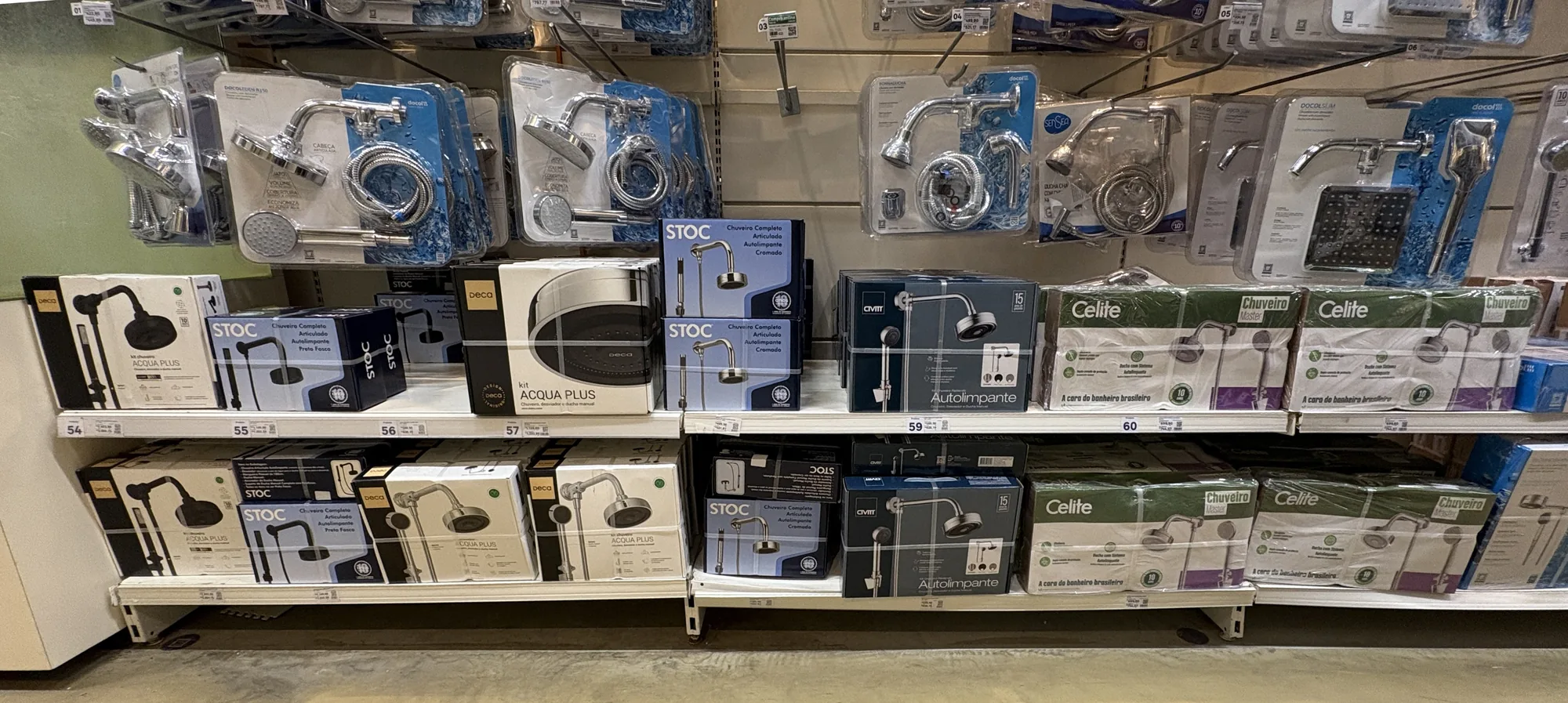
2 · The brand block
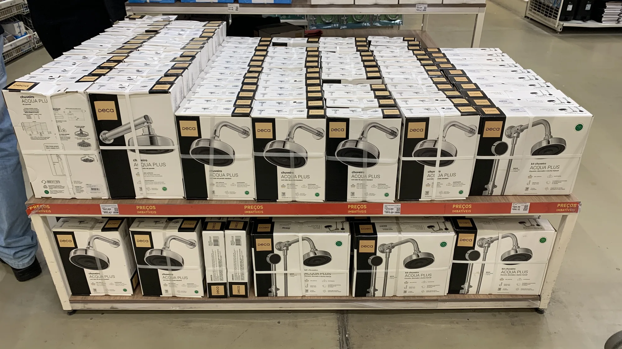
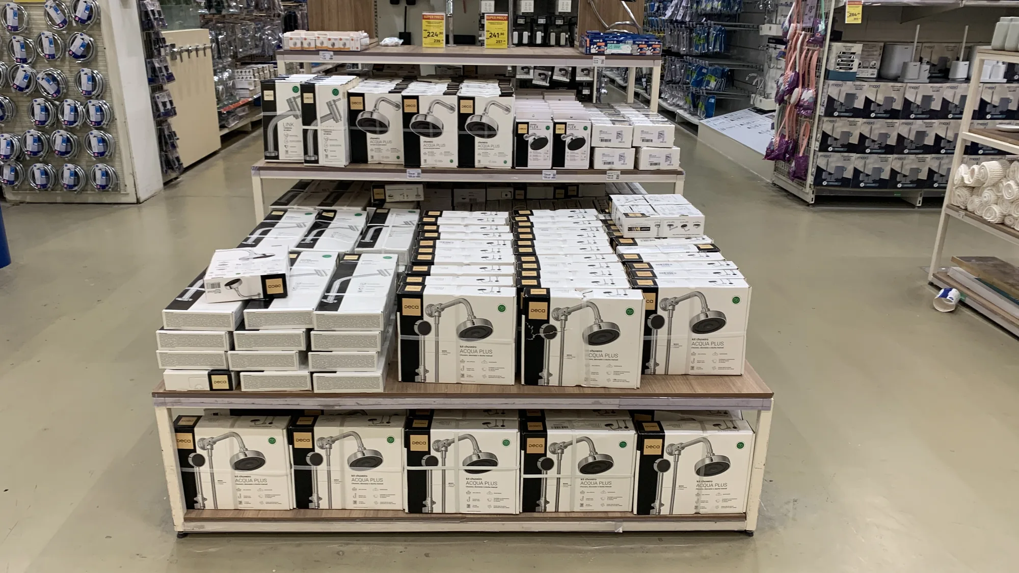
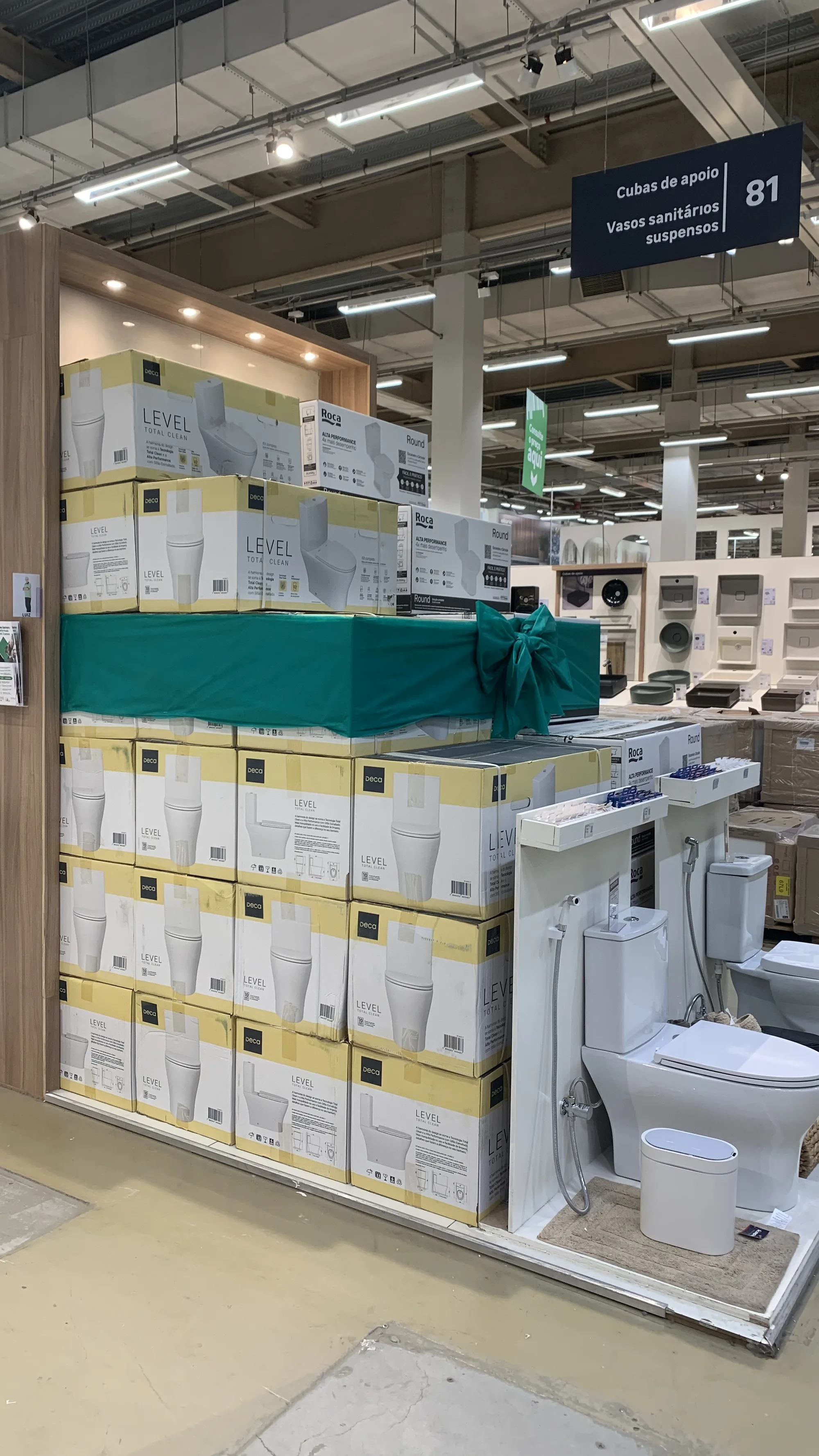
When the whole line takes the block, the system shows. The same logic repeated across dozens of boxes is what makes the brand readable from the other side of the aisle.
3 · The volume the store takes in
Sanitary ware packaging means big boxes, stacked on pallets and moved by forklift. It has to survive transport, explain itself standing up and keep working underneath the yellow price tag.
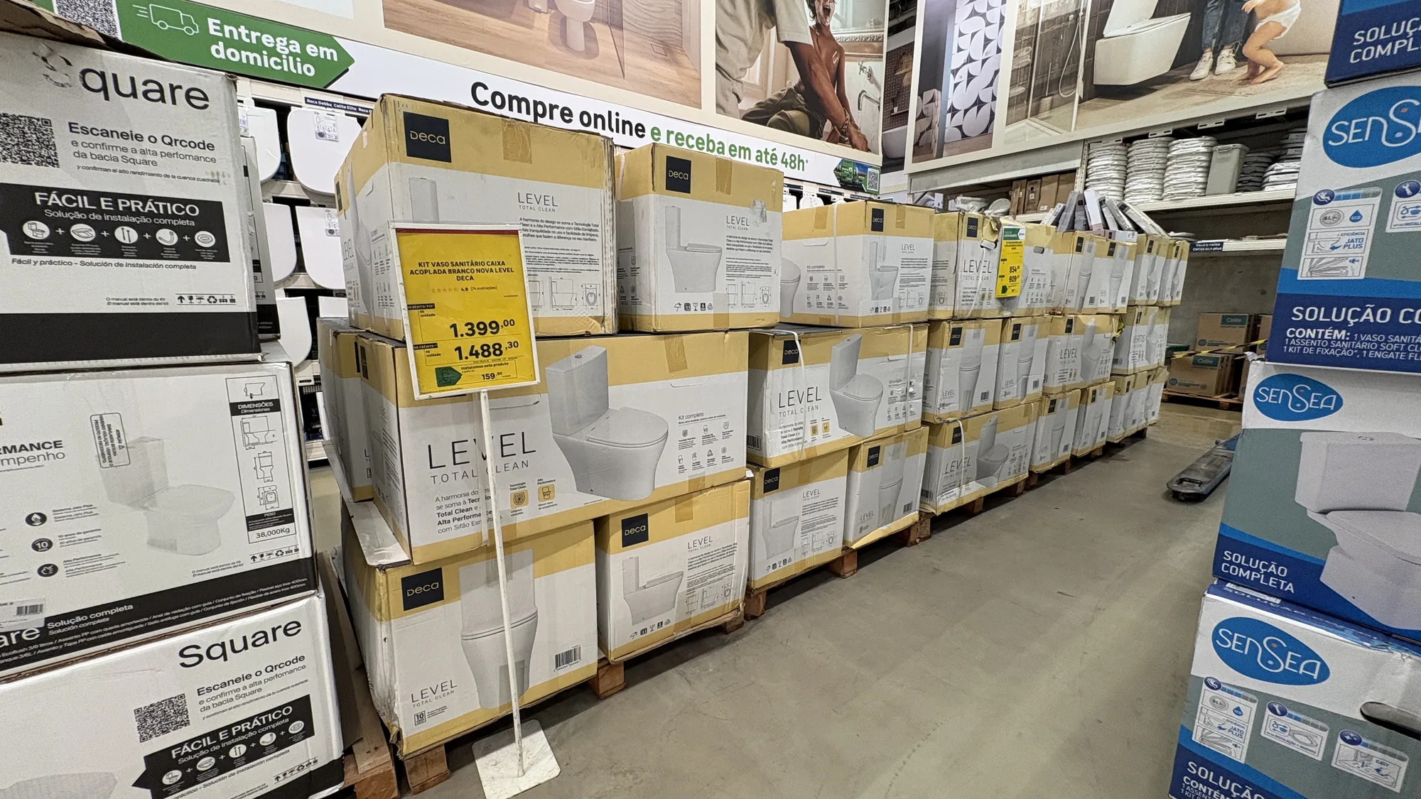
4 · The detail, up close
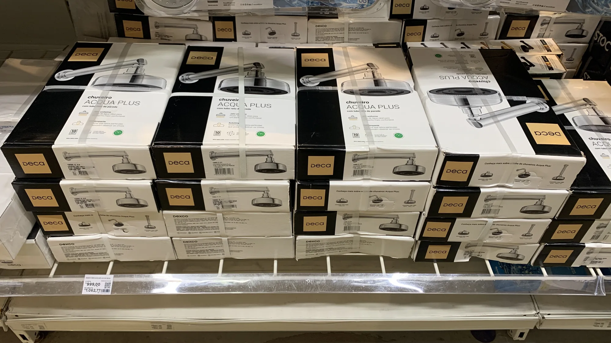
Up close is where the pack answers the only question that matters in the store: is this really the one I need?
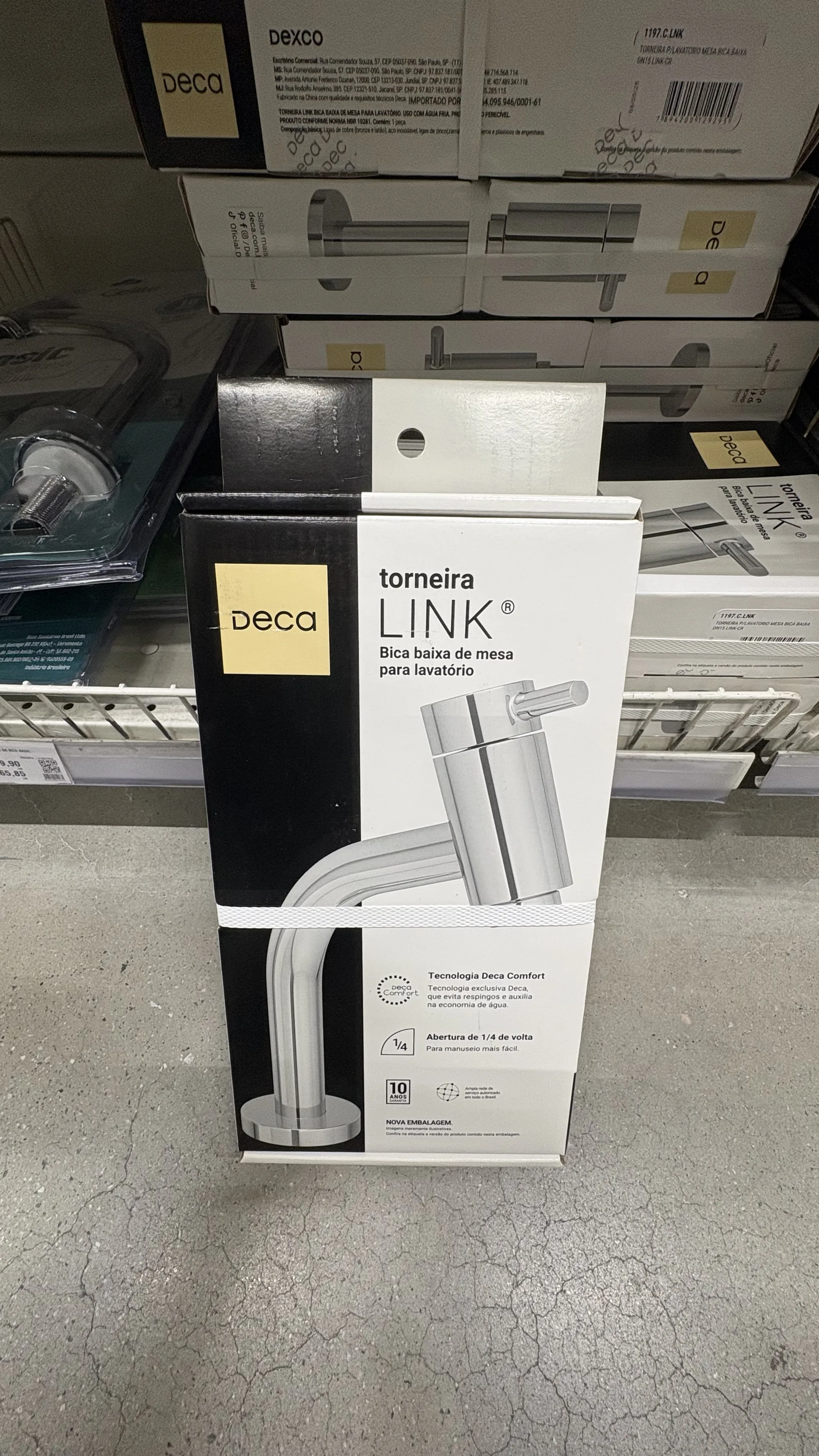
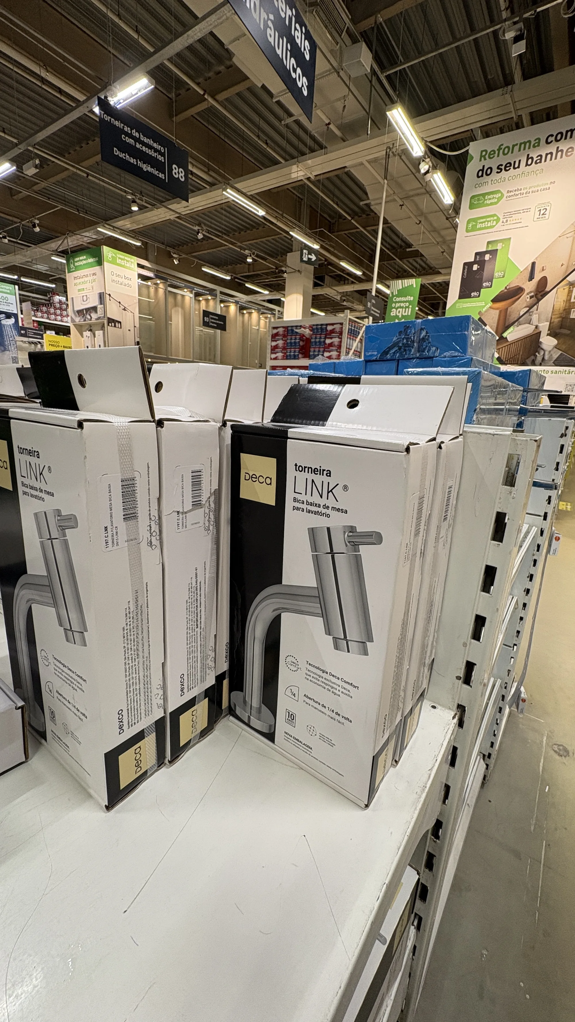
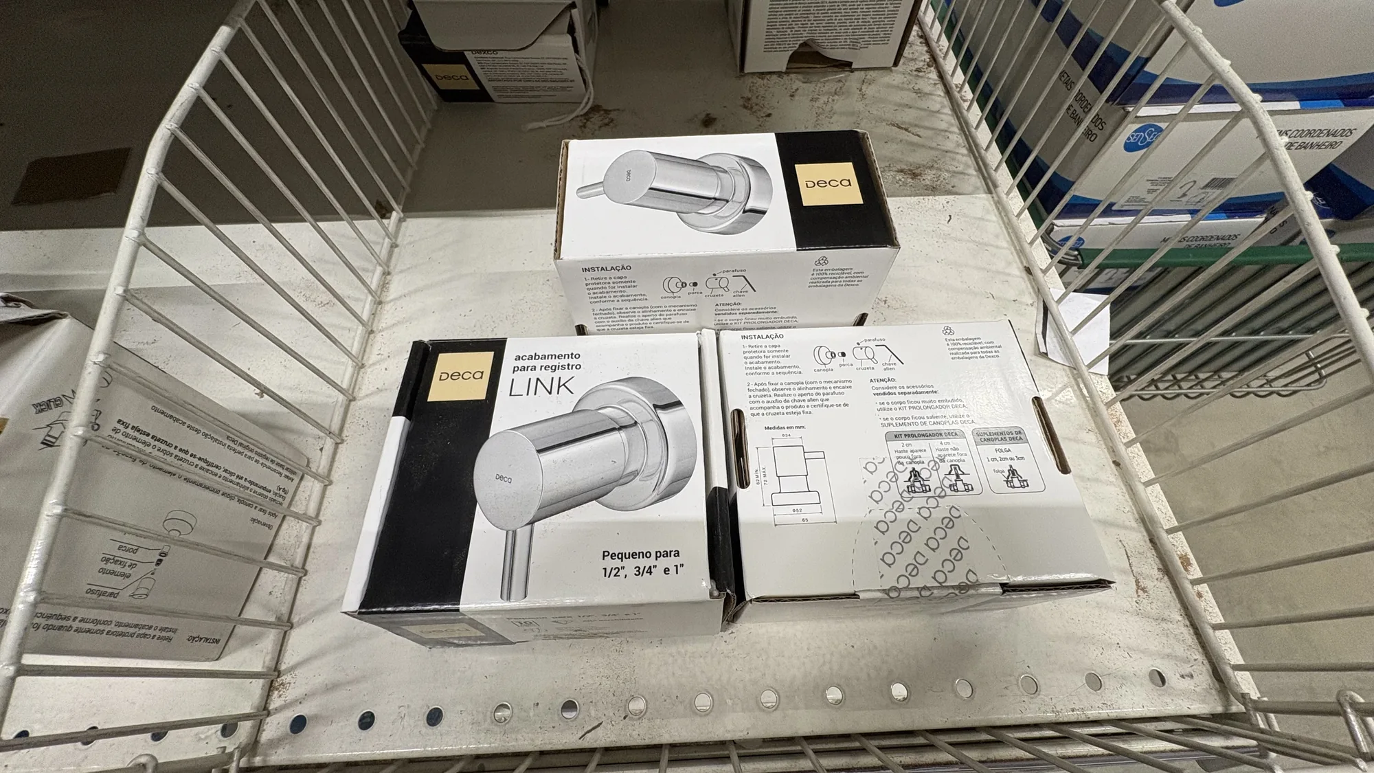
This is why I photograph the shelf before I design anything. A layout that only exists as a render has never been tested; these have, by people who had no idea whose they were and who had the competition right next to them to compare.
See each project from the inside, from briefing to print-ready artwork →