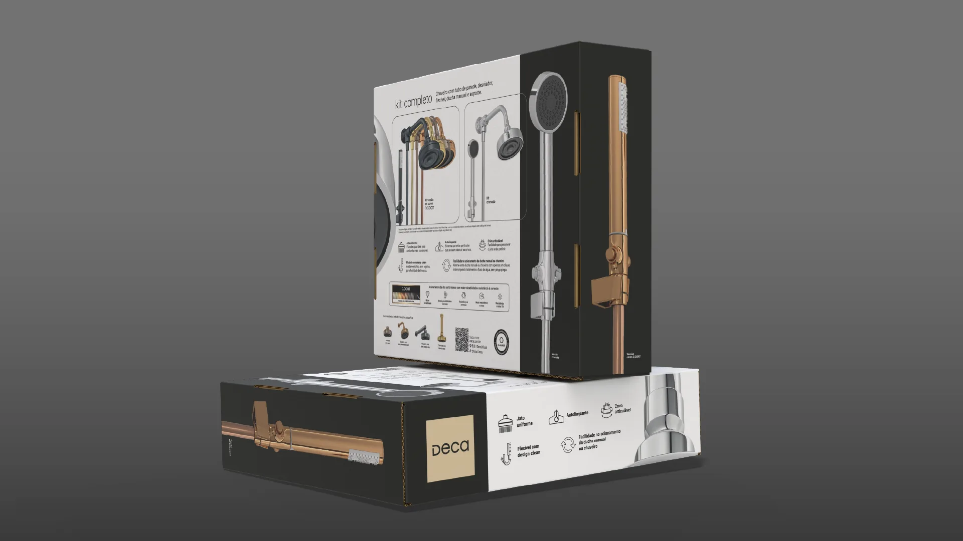
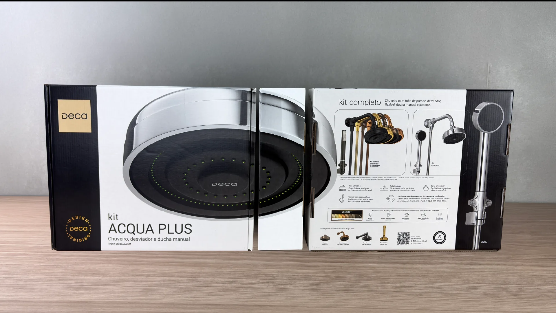
Render of the Acqua Plus kit packaging opened out in perspective, showing front, side and back, with the shower image running across the panels.

Winning back a pack the market copied.

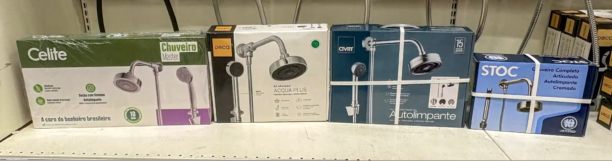
Acqua Plus leads the metal shower category in Brazil, and became the standard four competitors set out to imitate, not only in the product design but in the packaging as well. Here is the graphic redesign that gives differentiation back, and the structural rebuild underneath it.

The system

The new box

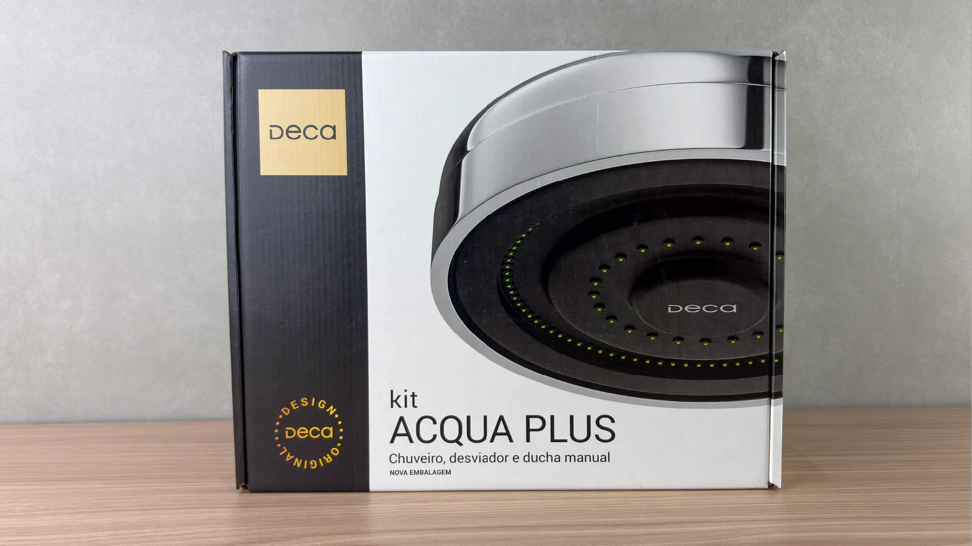
After the patent expired, we mapped 4 brands that had copied the design of the product and of the old pack. In this redesign the strategy was disruptive: sell the shower by what the user sees every day, the showerhead the water comes out of. An oversized showerhead, with the attributes stated right above it: the pack sells and explains in a single glance, which is the entire job in DIY store self-service.

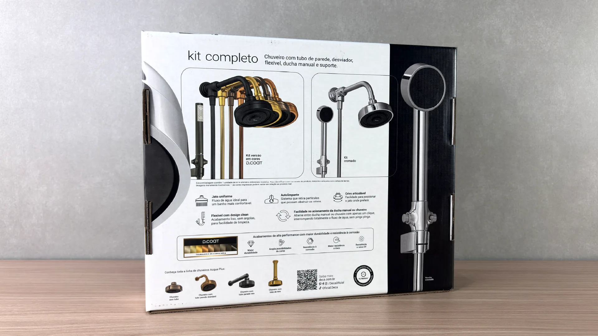
A single box serves two different products: the chrome kit and the D.COAT colour kit. The back panel solves this with two frames side by side: each version with its components drawn one by one, showerhead with wall arm, diverter, hose, hand shower and holder. No vague promise of a "complete kit": the shopper counts the parts.

Below the frames, a short line tells the shopper to check the barcode label: that is what defines the colour and the model inside. It closes the one remaining doubt and avoids the exchange at the till, which is the real cost of packaging that serves several SKUs.

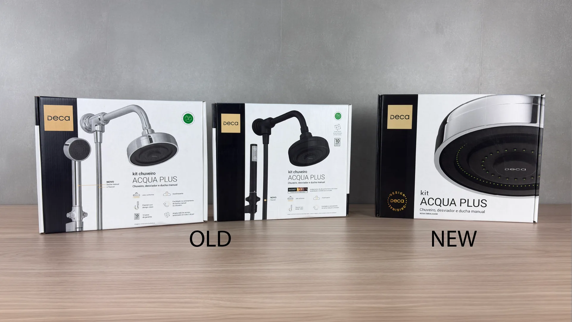
The structural redesign unified 2 kits with different components and geometries. The graphic redesign brought it all into one clear solution that leaves the consumer in no doubt.

The sides are not leftover area. On each one, the product continues from top to bottom at close to life size: the chrome hand shower on one side, the D.COAT colour version on the other. The image cut at the edge is an invitation: it only ends if the shopper turns the box.

And whoever turns it finds the rest of the argument: the whole kit on the back, the attributes as icons on the top, the finish in detail on the sides. In DIY store self-service, where there is no salesperson, it is the pack that guides the visit to the product.

Front of the Acqua Plus kit packaging: the oversized showerhead filling the whole panel, with the Deca brand on the black side band. Back of the pack: the D.COAT colour kit frame next to the chrome kit frame, the five attributes as icons and the full Acqua Plus line along the bottom. Comparison on the counter: the two old packs (one for the chrome model, one for the colour model) next to the new single pack. Render of two Acqua Plus packs stacked, showing the sides where the product image runs from top to bottom, in the chrome and D.COAT versions.

The project in one line

When the category copies the leader, the leader shows who sets the trend.

Acqua Plus defined the visual grammar of metal showers in Brazil, and then became its own liability: four competitors copied the packaging design and its way of communicating, with image, colour and layout close enough that the shopper stopped telling them apart. The redesign resets the Deca standard everyone had copied, and projects a new future scene in the DIY stores.

Photo of a real DIY store shelf: shower packs from Celite, CIVITT and STOC next to the previous Acqua Plus pack.
The real shelf, with the previous pack. Same shower photo, same layout, same colour band: from a distance, the leader disappears among those who copied it.

How it was done

The phases of the project.

Challenge

A leader that no longer looked like one: four brands copied product and packaging, and every point of parity started working in the copy's favour. Internally, two models locked into two packs, with a glued cardboard tray, slow to fold and far too weak for heavy metal parts.

Benchmark

We mapped four brands selling products and packs visually adjacent to Acqua Plus. When the leader's design becomes the category standard, the shopper reads "shower", not "Deca", and the weak tray was turning into a cost line in returns.

Solution

Graphic redesign: the oversized showerhead at the centre, attributes right above it, an image that bleeds across the panels and turns into a shelf block. Structural rebuild: one carton with a universal moulded pulp tray that takes two geometries and arrives pre-formed.

Impact

+50% units packed per hour, −20% material cost, two packs became one, eight SKUs in a single box, zero loss from mis-assembly and a 100% recyclable, FSC certified tray.

The differentiator

Two decisions the box carries.

The artwork runs past the edges of the panels, so three boxes side by side form a single billboard. Retail gains new ways to display the line without investing in any fixture, and the leader stands apart from the copy again.

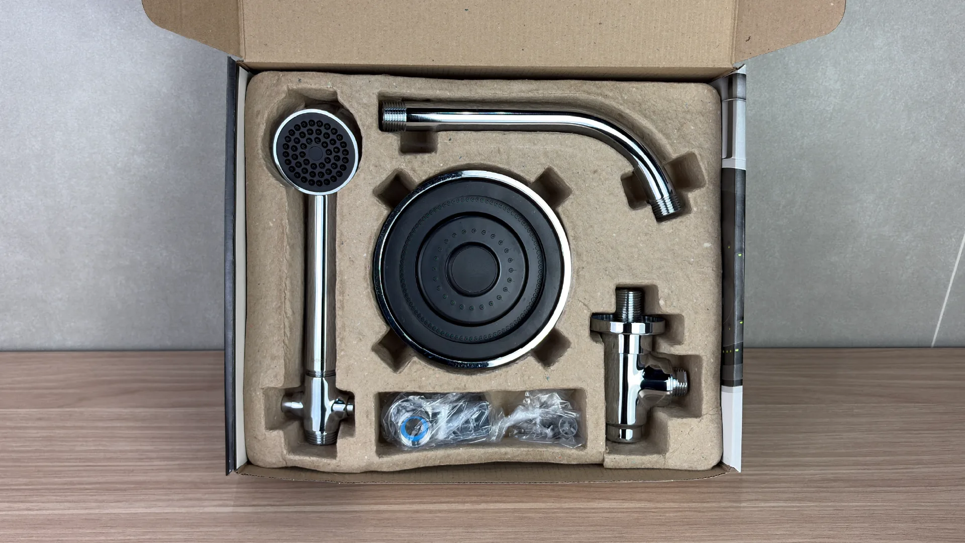
A single moulded pulp tray takes two component geometries, with supports and cushioning zones that lock the parts. Because it arrives pre-formed, it removes folding and assembly, and the intuitive fit brought loss from mis-assembly to zero.

Two Acqua Plus packs side by side, front and back, showing the shower image crossing the edges and continuing from one panel to the next. The pack opened seen from above: the moulded pulp tray locking the showerhead, the hand shower, the wall arm, the diverter and the accessories bag, each in its own recess.

The proof

Before and after, in the hands of whoever opens it.

The same kit in both packs, one after the other. In the old one, the manual printed on the back of the box and the cardboard tray that has to be folded on the line. In the new one, the pulp tray that arrives pre-formed and locks every part in place. That is where the +50% units packed per hour comes from.

Before and after of the Acqua Plus kit packaging · Deca, 2026