Challenge
Launching a category Brazilians do not know. Fewer than 5% of the country's sinks have a disposer; in the United States, half of all homes do. I had never used one myself, and every question I had ended up becoming a panel on the box.

Client: Deca · Food Waste Disposer
Food waste disposer: how do you sell a product the public does not know?
In short
Fewer than 5% of Brazilian homes have a food waste disposer; in the United States, half do. With no habit, no formed category and no salesperson in the store, the pack had to do the whole job. The category was selling disgust: white box, dirty sink, food scraps falling down the drain.
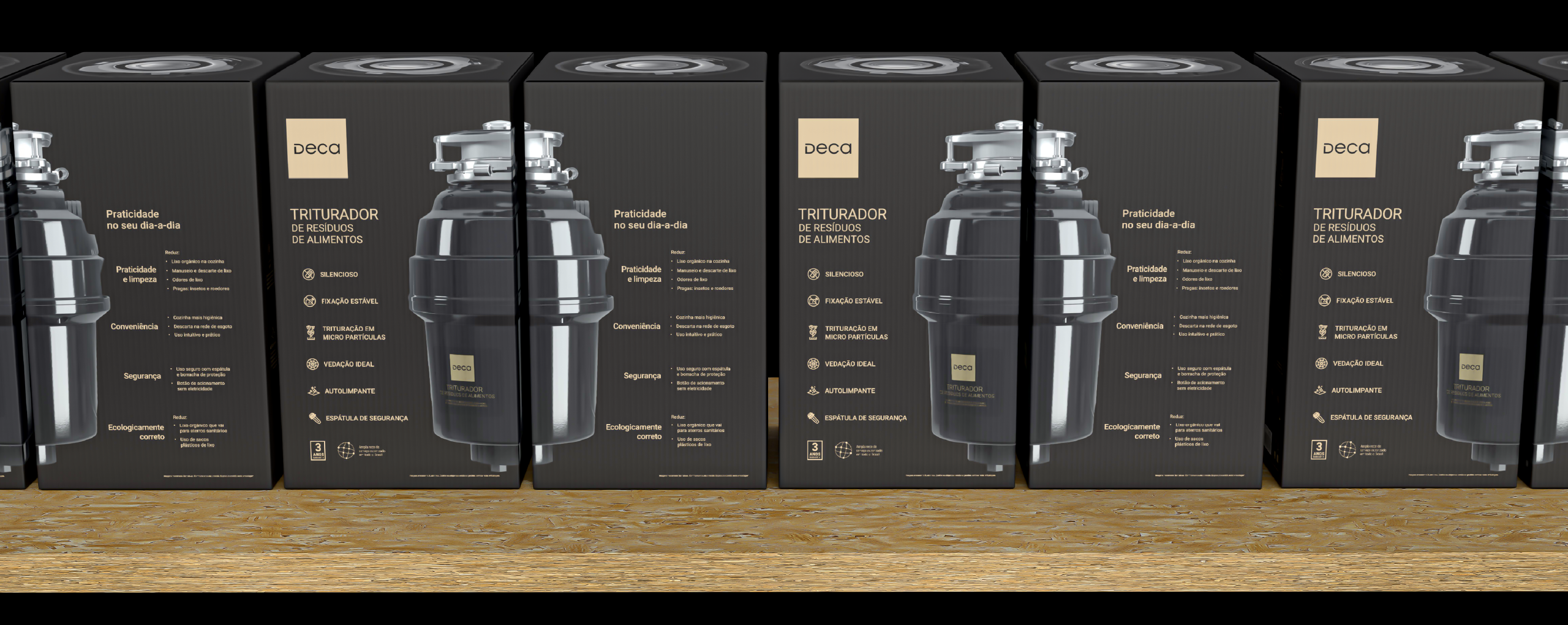
I designed the exact opposite of that and organised the box into a four-panel system, each panel answering one shopper question in the order the shopper asks it: what is this, what do I get, how is it made and how does it work. A dark palette instead of clinical white, a clean render instead of the dirty sink, icons drawn from scratch instead of food waste.
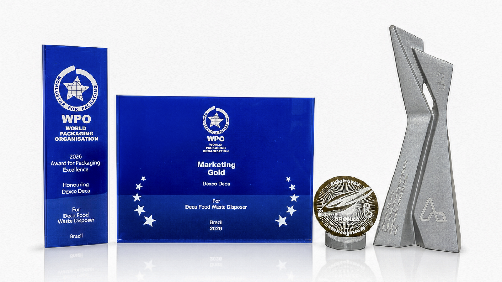
A shop owner sold the product on video without taking it out of the box. The project won the WorldStar Special Award Marketing Gold 2026, the most effective marketing pack in the world that year, plus the WorldStar in Household, ABRE 2025 Silver and Brasil Design Award 2025 Bronze.
The system
What is this, and can I trust it? The product at life size, the brand, and the line that names a category most people have never heard of. No claim yet. Recognition first.
What do I actually get? No smell in the bin, no trips downstairs with the rubbish, fewer insects at home. The technical attribute is translated into a gain, in the mind of the person reading.
How is it built? This is where the price justifies itself for anyone who reads: the technical attributes in detail.
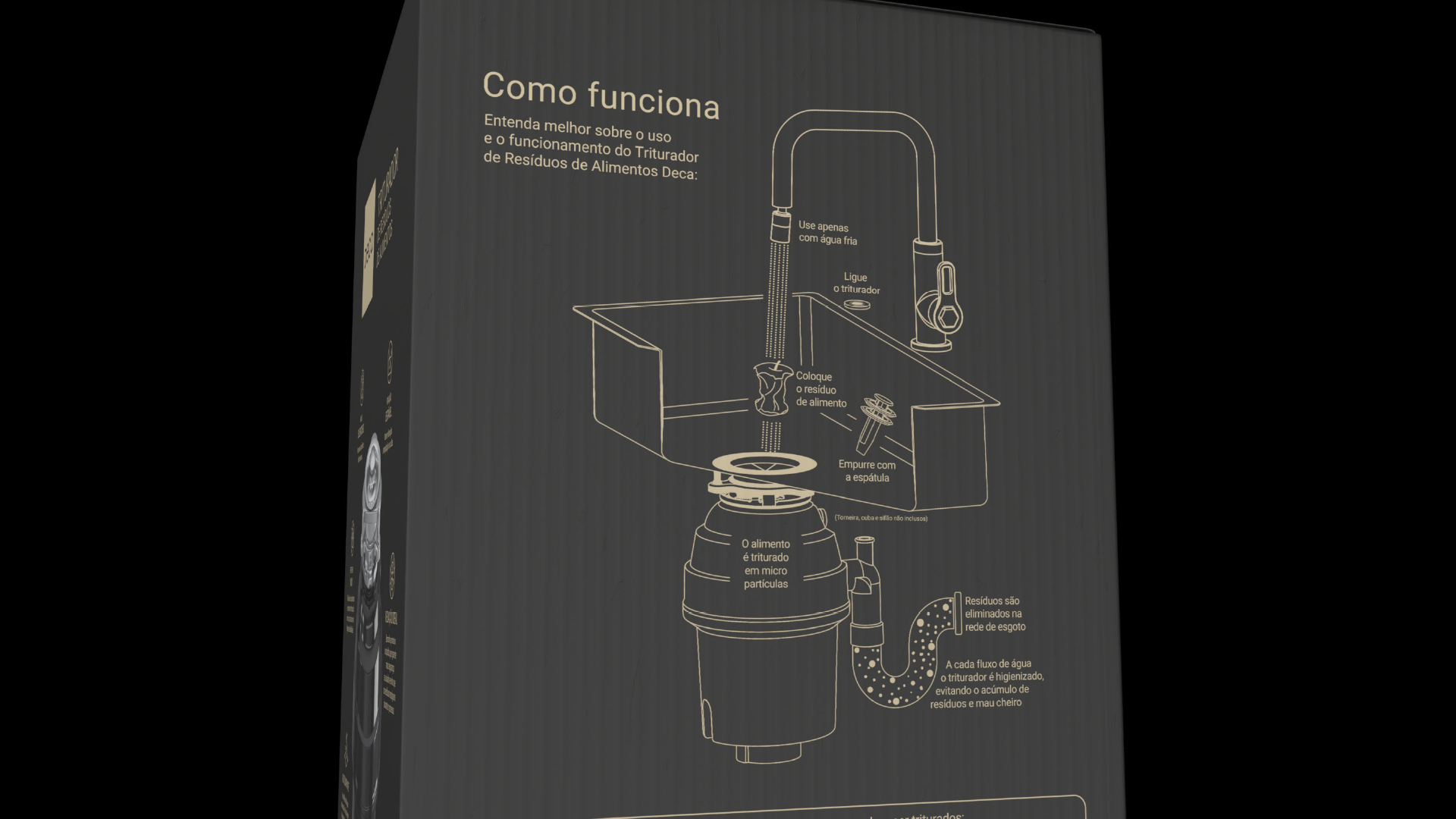
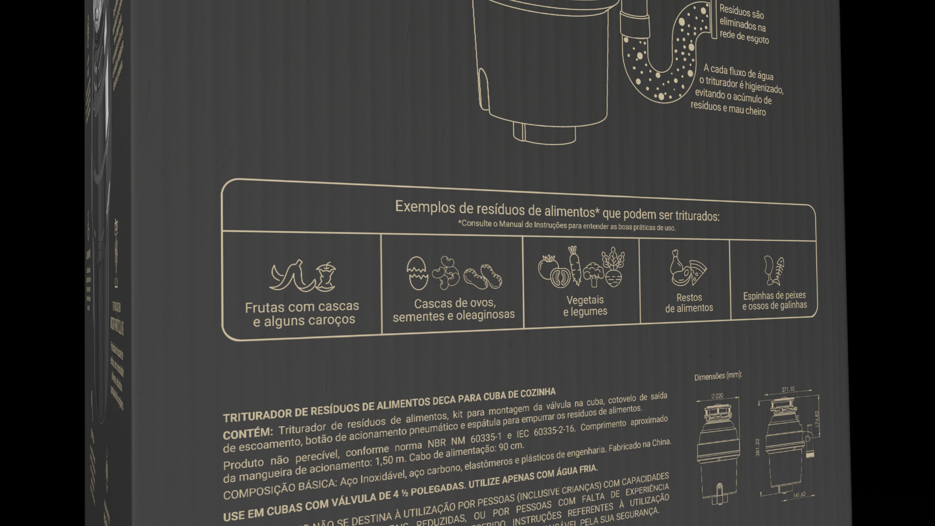
How does it work, and where does the waste go? What can and cannot be ground? An infographic drawn from scratch explains it in a simple, playful way and removes the last objection.
This is the view the user has of the product. The opening where the waste goes in sits on the worktop, seen and touched every day, while the body of the disposer lives hidden in the cabinet. The top got the same premium finish as the front, because this is the detail the customer lives with.
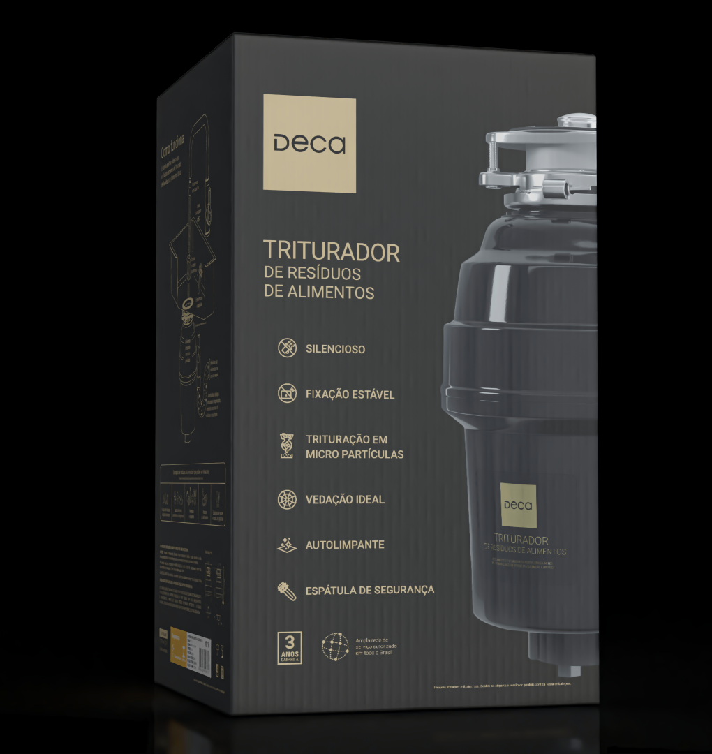
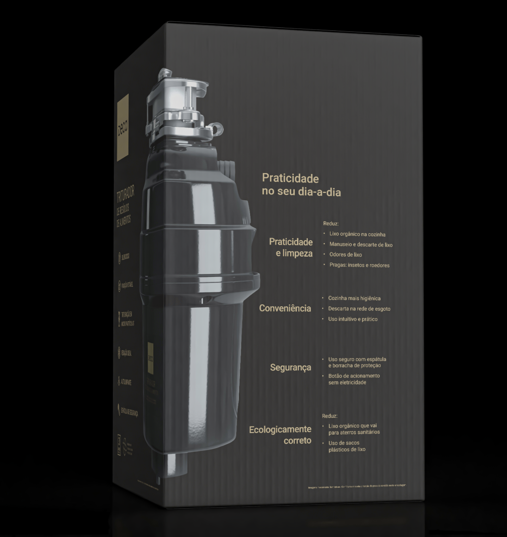
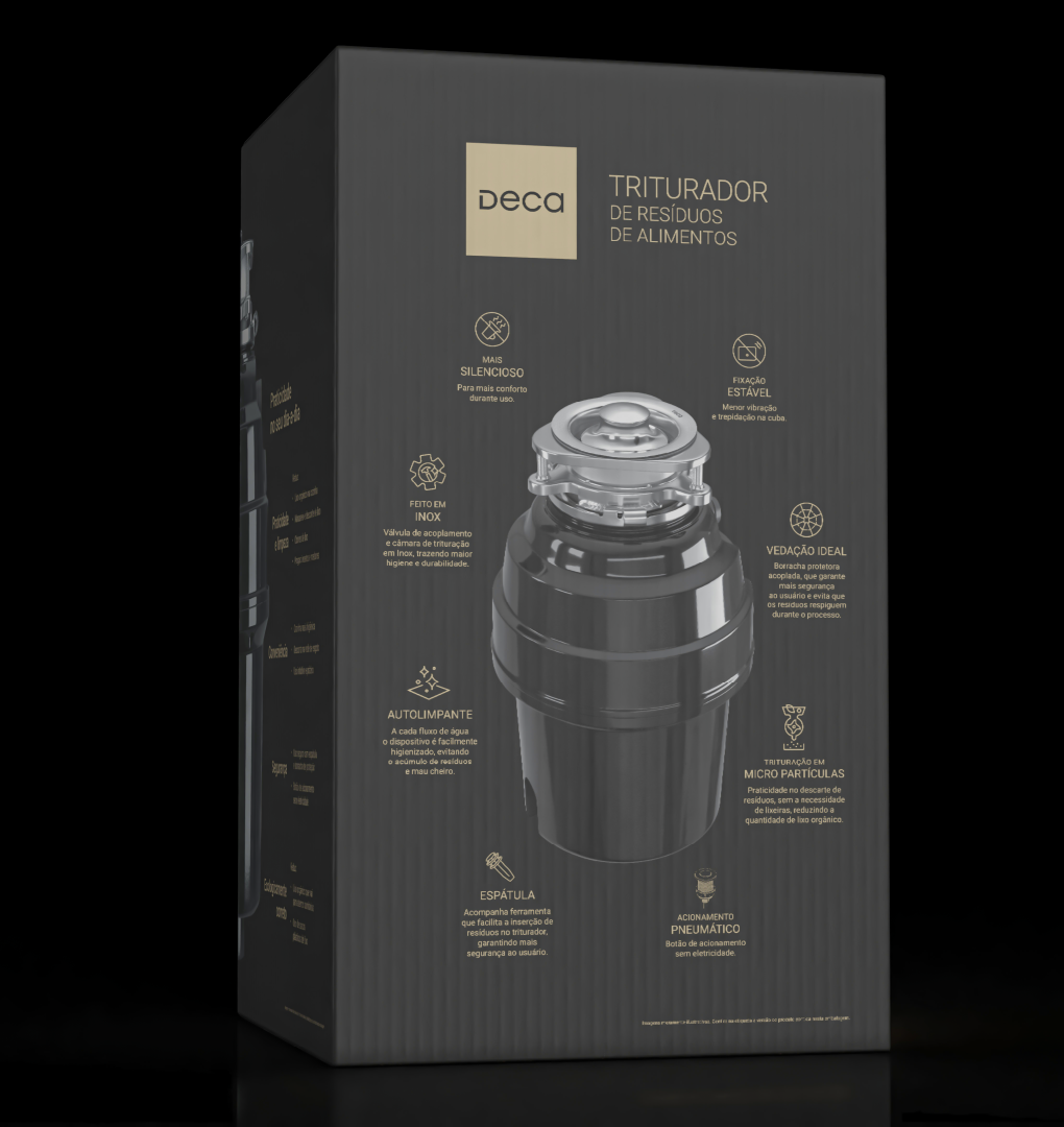
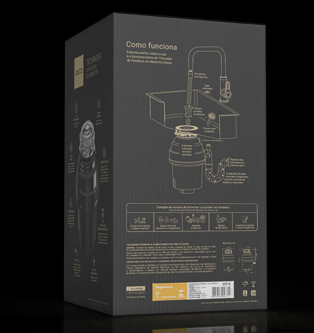
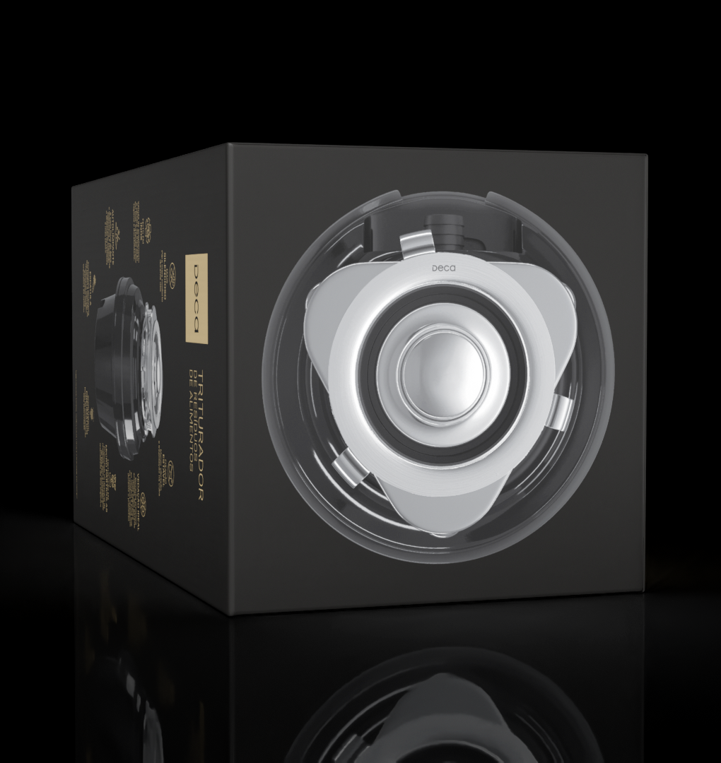
The project in one line
Fewer than 5% of Brazilian homes have a food waste disposer. With no habit, no category and no salesperson in the store, the pack had to do the whole job: explain what the product is, convince the shopper it is worth the price and teach them how to use it. All of it in a premium way, standing clear of the competition.
How it was done
Launching a category Brazilians do not know. Fewer than 5% of the country's sinks have a disposer; in the United States, half of all homes do. I had never used one myself, and every question I had ended up becoming a panel on the box.
The whole category was selling disgust: white box, dirty sink, food scraps going down the drain. "That's disgusting" was the unanimous reaction when I showed the references internally. Nobody had noticed the market was doing this to its own product.
I designed the exact opposite of the category. A dark palette instead of clinical white, a clean render instead of the dirty sink, cute icons instead of food scraps going down the drain. Four panels, one shopper question on each.
Gold at the WorldStar Special Award for Marketing, a WorldStar winner in Household, silver at ABRE and bronze at the Brasil Design Award. And the proof that counts for more than awards: a shop owner sold the product on video without taking it out of the box, simply reading the packaging.
The differentiator
A product almost nobody in Brazil has used has to explain itself. I drew an infographic from scratch, on the box itself: cold water, switch on, drop in the waste, push it down with the spatula, and where the waste goes afterwards. It demystifies the engineering for any layperson and removes the last objection before purchase, showing that the whole operation is safe.
The whole market answered "what can I grind?" with dirty sinks and scraps going down the drain, the very image that drives the shopper away. I replaced it with a system of friendly icons: fruit with peel, eggshells, vegetables, leftovers, even fish bones and chicken bones. More clarity, same information, opposite emotion.
The category
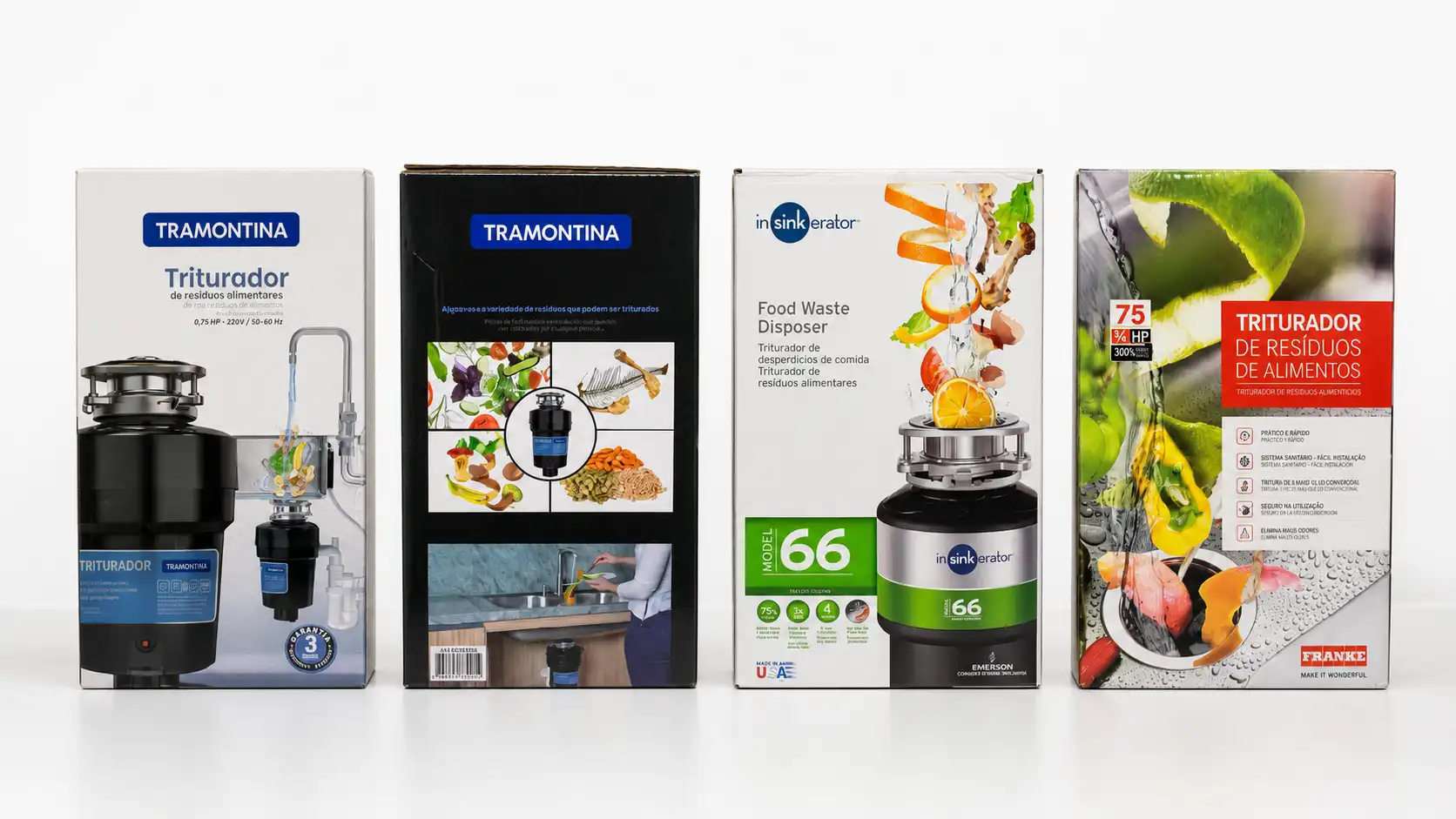
I bought the competitors and photographed all four side by side, the way the shopper meets them in the DIY store. Tramontina, InSinkErator and Franke: different origins, identical formula. A light box with the look of a mid-tier product, a warranty seal and a horsepower figure fighting for space on the front, and the waste in a big photo, either floating above the unit or spread across the sink.
Four brands saying the same thing in the same way cancel the difference between them. That alignment is what opens the one position still free on the shelf, and everything on the panels above comes from it.
The validation
She presented the launch, explained what it is, how it works and why to buy it, pointing at each panel of the pack. That is the entire thesis of the project, proven spontaneously by someone who never received a briefing.
Recognition
Four different juries reached the same verdict. At the WorldStar, run by the World Packaging Organisation, the pack won the Household category and then took the Special Award for Marketing, the gold given to the best marketing pack among all of the year's winners.
In Brazil, silver at the Prêmio ABRE da Embalagem Brasileira in Graphic Design and bronze at the Brasil Design Award.
Four cartons became one box and a pulp tray: assembly −50%, unit cost −21%.
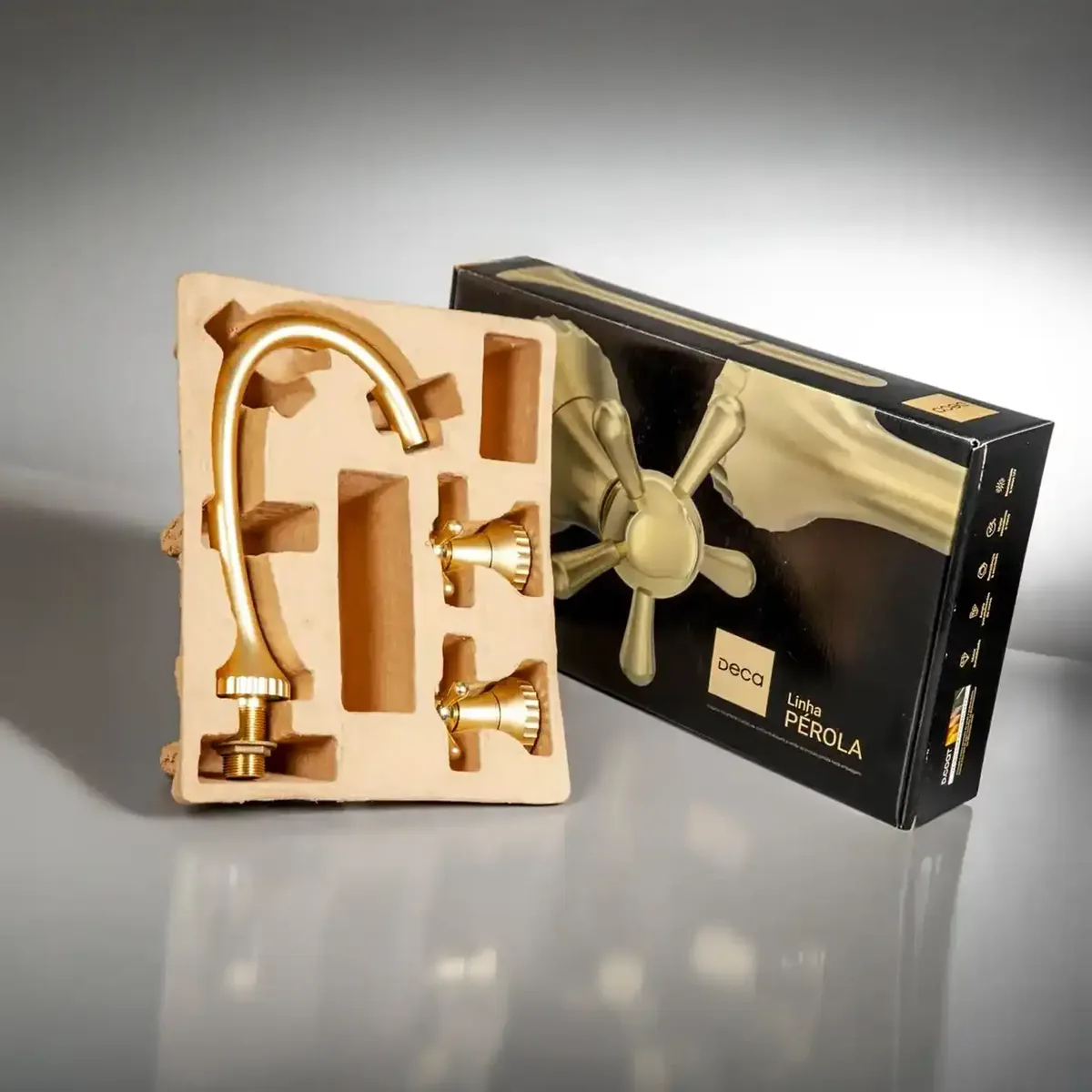
Winning back a copied pack: a graphic reset + a structural rebuild.
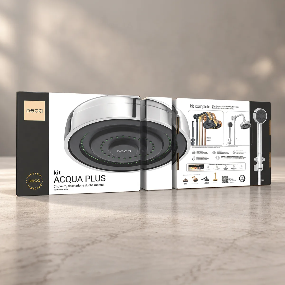
Regulatory compliance across an entire packaging portfolio.

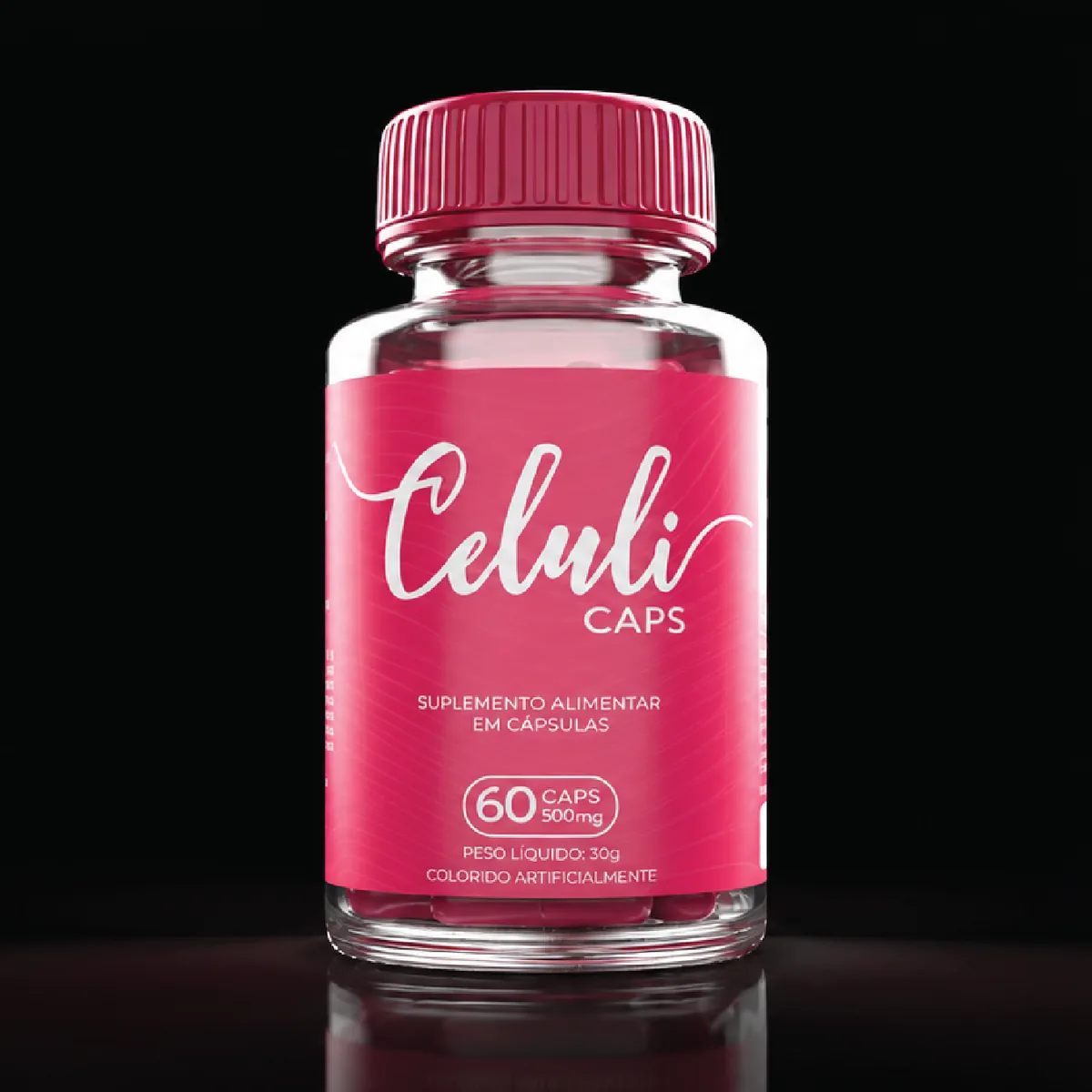
Building an anti-cellulite supplement brand without using a single weapon of the category.
The pack is the salesperson, especially in a new category →
Get in touch
If the answer is no, send me a photo of it on WhatsApp and I will tell you what I would do. If you are hiring, email is the usual route.
São Paulo (GMT−3) · Open to international roles and to projects