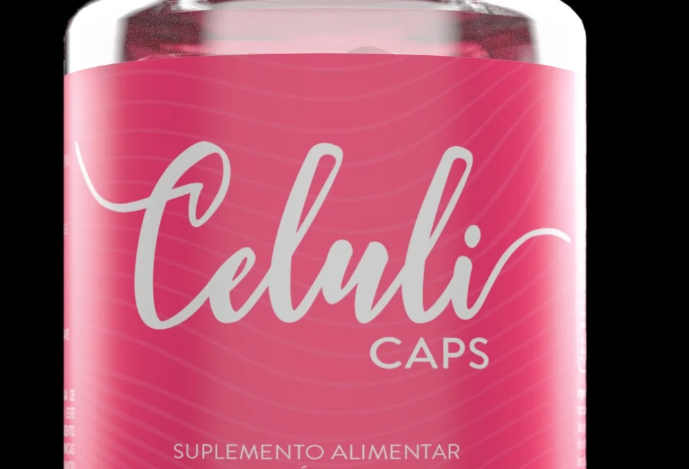
Transparent Celuli Caps bottle with a pink label and a handwritten logotype in silver, isolated against a black background.

Anti-cellulite without before and after.

Celuli Caps: visual identity, label and launch assets for a supplement in capsules, in a category that sells on promises in capital letters.

The system

The pieces of the brand.

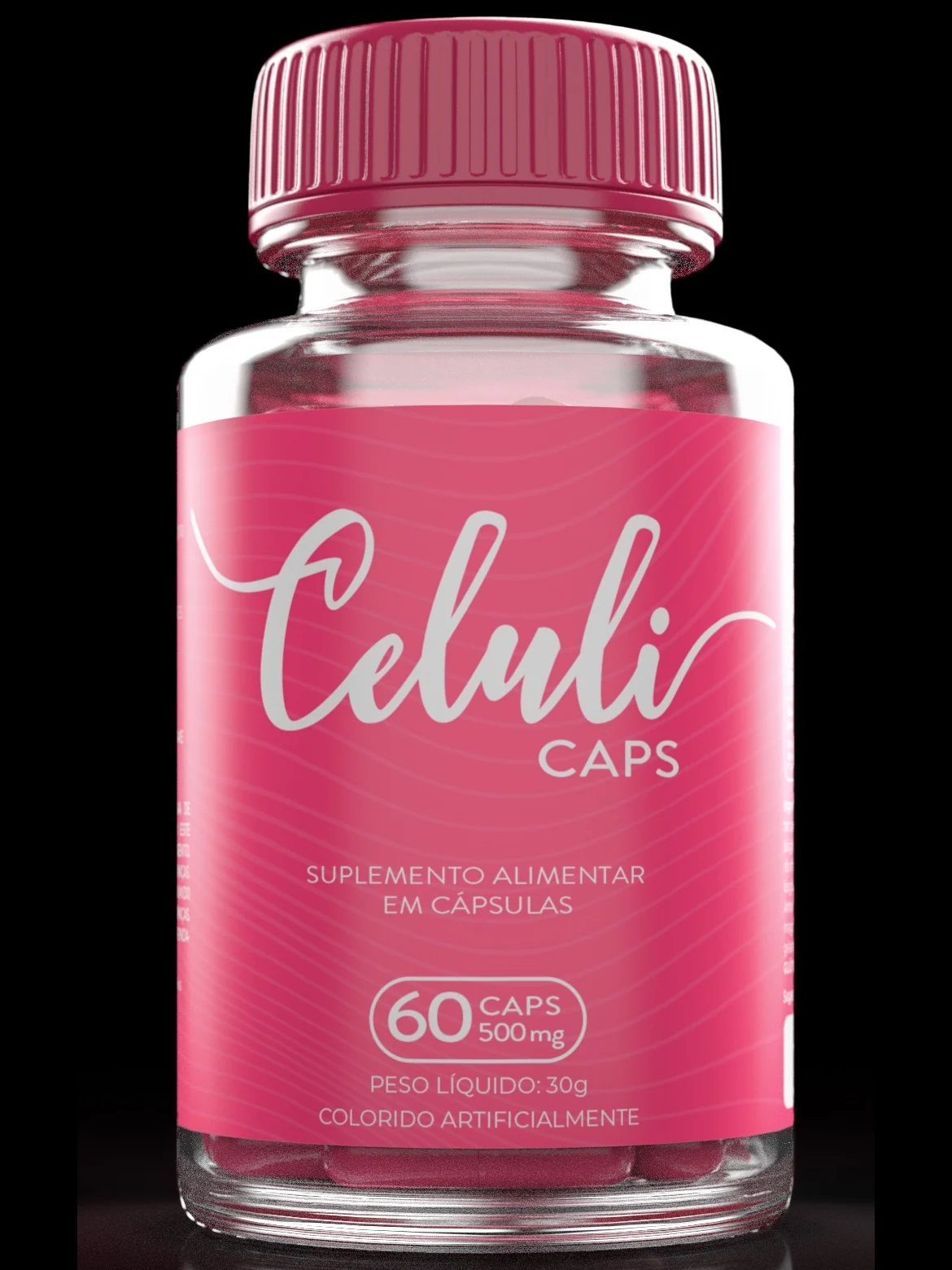
The bottle is small, transparent and has no carton: the label is all the brand has. A handwritten logotype in silver on saturated pink, a low-contrast wave graphic behind it, and only three pieces of information at the first level: what it is, how many capsules, how much it weighs. No promise on the front.

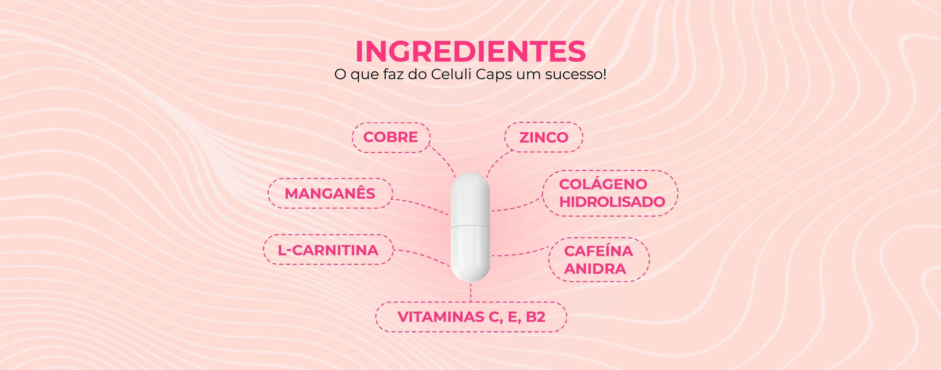
The wave from the label left the bottle and became the brand's graphic system: background, divider, frame. Here it carries the ad that explains the formula: hydrolysed collagen, L-carnitine, anhydrous caffeine, zinc, copper, manganese and vitamins. Label information turned into a sales argument, without turning into a package leaflet.

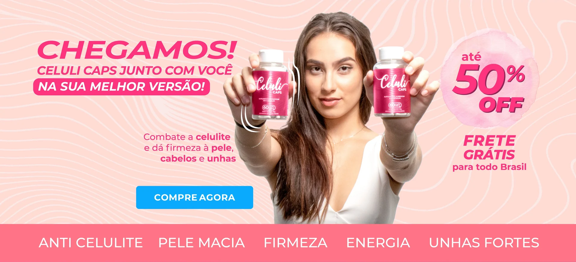
The launch went out in pale pink, with a real person holding the product and the benefit summed up in five words on the bottom band. Same palette, same graphic, same typography as the label: the ad and the bottle look like the same object, which is what makes a new brand look bigger than it is.

Macro detail of the Celuli Caps label: the handwritten logotype in silver on saturated pink, with the low-contrast wave graphic behind it. Ad for the Celuli Caps formula: a capsule at the centre with the ingredients connected by dashed lines: hydrolysed collagen, L-carnitine, anhydrous caffeine, zinc, copper, manganese and vitamins C, E and B2. Celuli Caps launch banner in pale pink, with a person holding two bottles and the benefits band along the bottom.

The project in one line

Selling firmness without promising a miracle.

Celuli Caps is an anti-cellulite supplement, a category that in Brazil sells on before-and-after photos, invented numbers and guaranteed deadlines. The job was to build a brand from scratch that would fit that shelf without using a single one of those weapons, and that would survive being photographed by the customer, on a phone, with no studio. Identity, label and the kit of launch assets, in 2021.

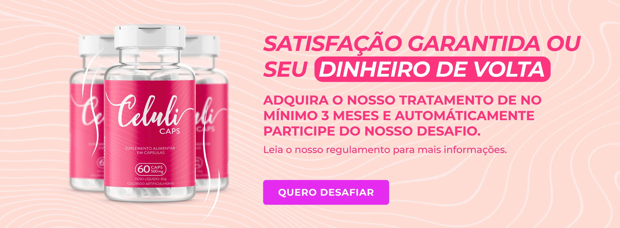
Celuli Caps campaign asset with three bottles on the left and, on the right, the satisfaction guaranteed or money back offer for anyone buying the three-month course.
The promise left the bottle and moved to the campaign, where it can actually be redeemed: a money-back guarantee instead of a before-and-after photo.

How it was done

The phases of the project.

Challenge

A new brand, with no track record and no traditional media, in a segment where the shopper has seen it all and distrusts by default. Before saying anything about results, the product had to look trustworthy, and that is the label's job, not the copy's.
Benchmark

The competition sells on before-and-after photos, guaranteed timeframes and promises in capital letters. The side effect is that everything looks alike, and what looks like aggressive advertising also looks like something that does not work. Nobody was trying to be the sober product on the shelf.

Solution

A label that looks like cosmetics, not like a miracle formula: saturated pink, a handwritten logotype in silver, a discreet wave graphic and only the mandatory information on the front. The promise was moved to the campaign, where it can be redeemed: a money-back guarantee.

Impact

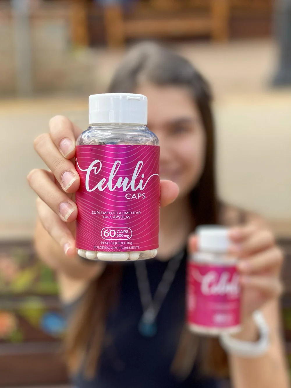
The product became customer content. The brand started reposting photos and videos from people who had bought it, and in every one of them the label reads clearly: in the hand, at arm's length, on a phone camera. That was exactly the framing it had been designed for.

The differentiator

Two decisions against the category.

The category shouts in red, yellow and condensed capitals, the grammar of discounting. Here there is a single pink, the logotype is handwritten and the text is silver: the cosmetics palette, which the shopper already associates with care rather than promotion. The wave graphic stays almost invisible, giving texture without becoming one more element asking for attention.

This product was not going to be seen on a shelf, but in a phone photo, in someone's hand, at arm's length. That defined the label: a large logotype filling the central third, high contrast between silver and pink, and no small text at all on the front. Everything that needs close reading went to the back panel.

Celuli Caps bottle in detail: pink label with a handwritten logotype in silver, the food supplement descriptor and the 60 capsules of 500 mg seal. Real photo of a person holding the Celuli Caps bottle close to the camera, with the label readable at arm's length.
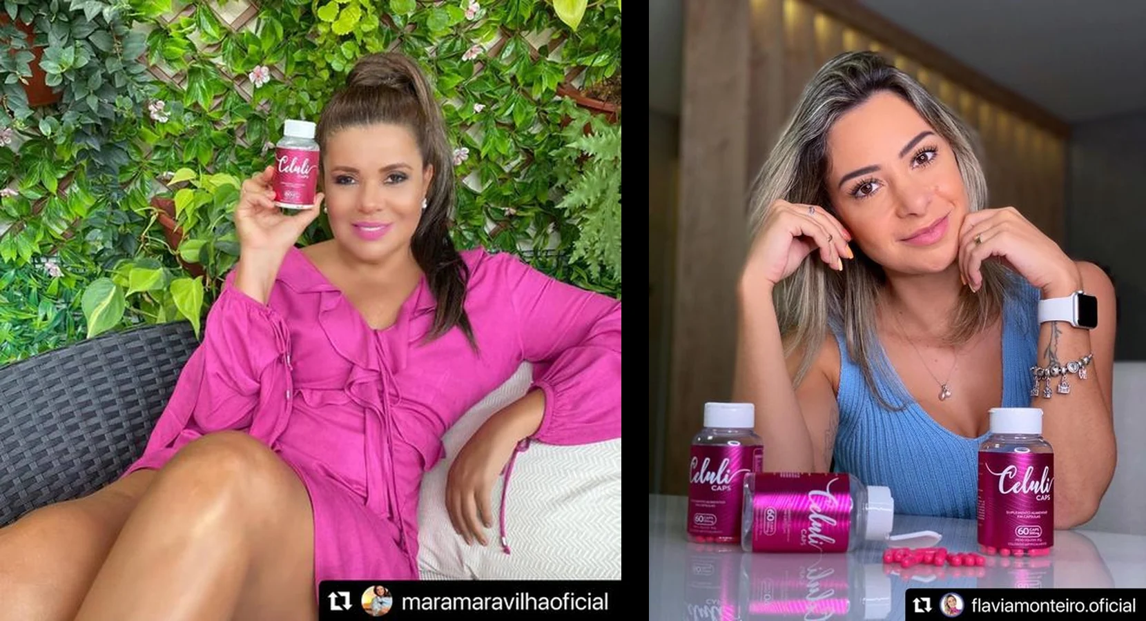
Two social media posts reposted by the brand, each with a person holding Celuli Caps bottles.
Content published by @maramaravilhaoficial and @flaviamonteiro.oficial and reposted by the brand.

The proof

The label that holds its own.

The brand had no media campaign: what it had were reposts. Photos from people who bought it, videos from people who recommended it, third-party content where nobody controls the framing, the light or the background.

It is the hardest test a label can take, and the reason this one was designed for the frame it would actually appear in, and not for the approval PDF.