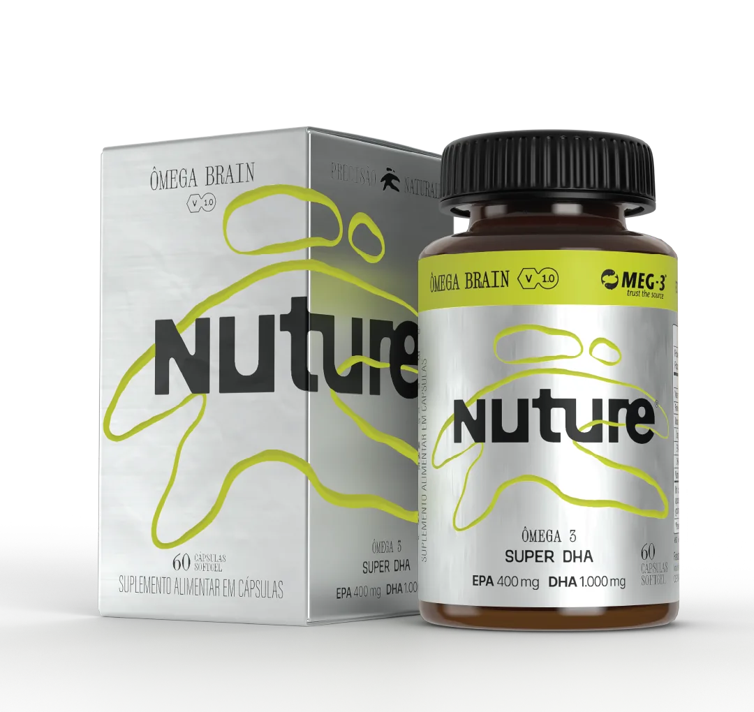
Amber bottle and metallic carton of the Nuture Ômega Brain on a white background, with the brand's black logotype and lime-yellow graphic.

Client: Nuture · Line extension

A finished brand. A whole line still to roll out.

Nuture is a powdered multivitamin for athletes, sold on the brand's own website. The identity came from a branding agency. My job was to turn it into labels that pass ANVISA (Brazil's health regulator), files the printer can print and a new product, the Ômega Brain, created inside the same family.

In short

How do you roll an existing identity out into new packaging?

Nuture is a supplement brand for athletes built on a single product: a powdered multivitamin, in a can, sold on the brand's own website. The branding, the visual identity and the first version of the pack were created by an agency in Rio de Janeiro. The client hired me as a freelancer, between 2025 and 2026, for the next stage: turning that identity into production-ready packaging. I made the can labels for three formula versions, each one reviewed with the brand's regulatory team under ANVISA (Brazil's health regulator) rules, redesigned the sachet the client had not approved, created the 5- and 15-sachet displays and designed a new product from scratch, the Ômega Brain, with an identity born out of the can. On every item, I closed the files for print and defined specifications and finishes. No award and no sales figure: this case exists to show the work that holds a brand up after it is born.

Project credits

Client
Nuture
Category
Sports supplement, line extension and rollout
Year
2025 to 2026
My role
Freelance packaging designer, from the files handed over by the agency to print-ready artwork
Scope
Can labels in three formula versions · Sachet redesign · 5- and 15-sachet displays · Creation of the Ômega Brain · Finish specification · Print-ready artwork and prepress. The branding, the visual identity and the first version of the pack belong to a branding agency in Rio de Janeiro; the formulation and the regulatory validation, to the brand's development team. The rollout, the Ômega Brain and every production file are mine.

The system

Five packs, one identity.

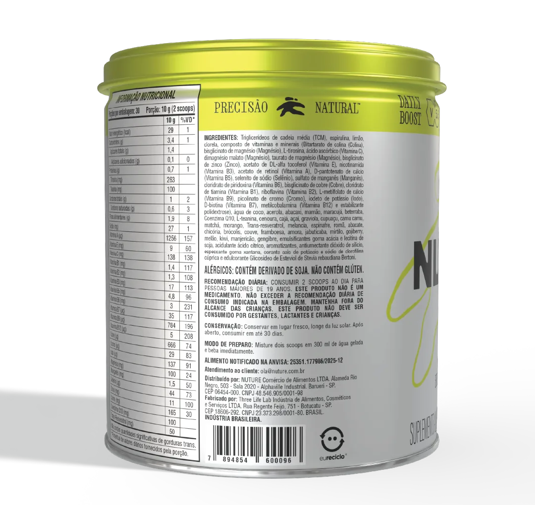
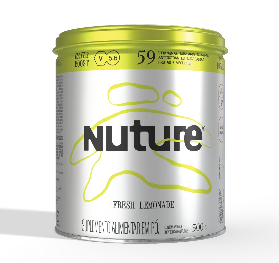
Everything at Nuture starts from the powdered multivitamin can. The agency delivered the first version; from there, every formula update called for a new label. I made three: formula 5.1, 5.5 and 5.6. In each one, the nutrition table, the claims and the mandatory copy were reviewed with the brand's regulatory team, under ANVISA rules, before the file went to print.

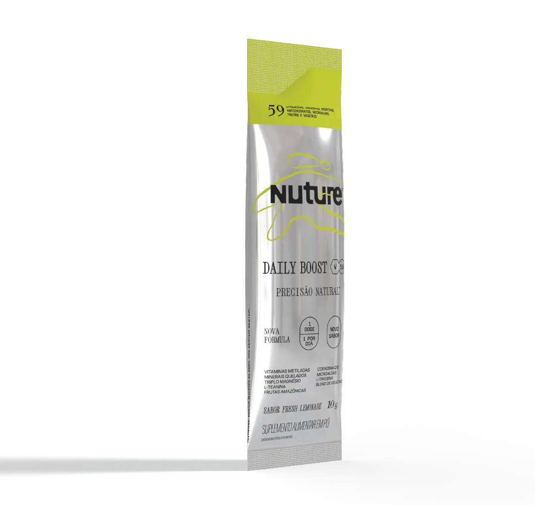
The sachet version delivered by the agency did not convince the client, and that was the first request I received. I redesigned the piece from the can: the same hierarchy, the same brand up front, and the essentials fitting a small print area, with the mandatory information legible.

A sachet is the same product in another format. It has to be recognised as Nuture from a metre away and keep saying what it is, what it is for and how to use it.

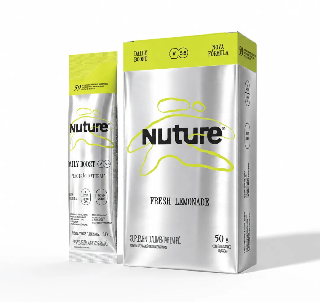
There are two boxes. One pack for 5 sachets and another for 15, each with its own die-line, its own artwork and its own mandatory sales-unit copy. The 5 is the entry pack, the first purchase for someone who does not know the product yet; the 15 is the repeat purchase for someone already using it. The image shows the 5-sachet box, with a sachet beside it.

Both follow the same system as the can: the brand and the benefit grow with the available area, and the mandatory information stays at the size the rules require, in the place the regulatory team approved. Both went out with closed files, finish specification and a prepress check.

The only item created from scratch. The Ômega Brain, in capsules, in an amber bottle and a carton, which had to look like a sibling of the can without copying it: the same brand, the same graphic and the same brand book, applied to a different format, a different category and a different set of information.

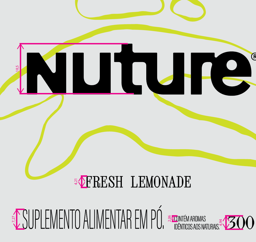
300 g can of the Nuture Daily Boost multivitamin, Fresh Lemonade flavour, with a lime-yellow cap, a metallic body and the brand graphic in line art. 10 g sachet of the Nuture Daily Boost standing upright, metallic, with the lime-yellow band at the top and the brand over the graphic. 5-sachet display box of the Nuture Daily Boost, 50 g, with a single 10 g sachet propped behind it. Metallic carton and amber bottle of the Nuture Ômega Brain, 60 softgel capsules, side by side.

The project in one line

Packaging does not end at the concept. It ends at the printer.

Nuture came to me with its branding well resolved: brand, visual universe and brand book, all created by a branding agency in Rio de Janeiro. What was missing was the other half of the job, the half that never shows up in a presentation: a label that passes regulatory review, a file the printer prints without rework, specified finishes, a sachet that works in the hand. It took about three months, with no numerical target and no cost ceiling, and a single untouchable rule: the brand book. No identity decision was mine. Every production decision was.

How it was done

The phases of the project.

Challenge

A single-product brand, sold on its own website for around R$ 400, with a fresh rebrand by a branding agency. The agency had solved the concept and the identity; the practical design of the packaging was not its speciality. The sachet did not work, the files were not prepared for the printer and the brand needed a new product, the Ômega Brain, inside the same universe.
Benchmark

I did no shelf research: the product is not on a shelf, it sells through the brand's e-commerce. The repertoire came from elsewhere. I have worked with supplements since Nestlé Puravida, where I restructured more than 150 SKUs for the 2023 ANVISA rules, and I know what a label in this category needs to say, in what order, and what the regulatory team will ask for before approving.

Solution

I sat down with the brand owner and we defined the hierarchy: what the product has to show in order to sell, from most to least important. The brand first, because Nuture is driven by it; then what the product is, the benefit and what it is for. That order became the system applied to the can, the sachet, the two displays and the Ômega Brain, always inside the brand book.

Impact

Three can label versions validated with the regulatory team and closed for print, the sachet redesigned, two displays and a new product created from scratch, in about three months. No award and no sales figure to quote: the result of this project is a whole line that left my desk ready to produce, with specification and finish defined.

The differentiator

Three things this project proves.

The Ômega Brain was created from scratch, but inside a brand book closed by another team. The freedom was in translating: choosing what carries over from the can to a capsule bottle and a carton, what changes scale, what disappears. It is the job an established brand most often asks of a packaging designer: growing the family without breaking the system.

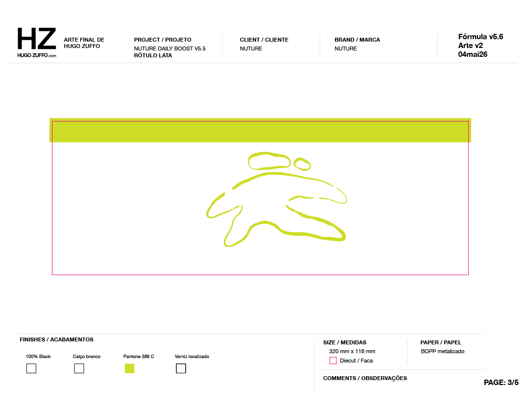
A branding agency delivers a concept; a printer needs a file. Between the two sit bleed, overprint, colour profile, outlined type, specified finishes and a checked proof. I rebuilt the files for the whole line to that standard and defined the finishes for the label, the box and every product.

It is the part of packaging design that never shows up in a presentation and that decides whether the piece leaves the printer the way it was designed.

Every formula update changed the nutrition table, the claims and the mandatory copy. I worked in tandem with the team responsible for product development, correcting the artwork at every validation, within the ANVISA rules for supplements. Anyone hiring a packaging designer for food asks for this in the job description. Here it is, done.

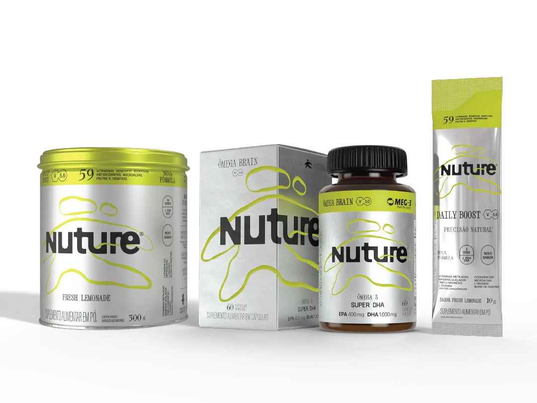
The four formats of the Nuture line side by side: the 300 g can, the carton and the amber bottle of the Ômega Brain and the 10 g sachet. Print-ready artwork sheet for the can label, formula 5.6: the die-line marked in magenta, the 320 by 118 millimetre size, the metallic BOPP material and the finish list with Pantone 389 C.

Get in touch

Does your packaging do this job?

If the answer is no, send me a photo of it on WhatsApp and I will tell you what I would do. If you are hiring, email is the usual route.

São Paulo (GMT−3) · Open to international roles and to projects