Bottle and carton of Puravida Bio Vit. D+ in yellow against a black background, with the green side band for the Vitamins category.

A system that brought 150+ SKUs in line with the rules of ANVISA.

Puravida (Nestlé Health Science): the packaging architecture of the supplement line and the restructuring of the entire portfolio to meet the new 2023 rules of ANVISA (Brazil's health regulator).

The system

The architecture of the line.

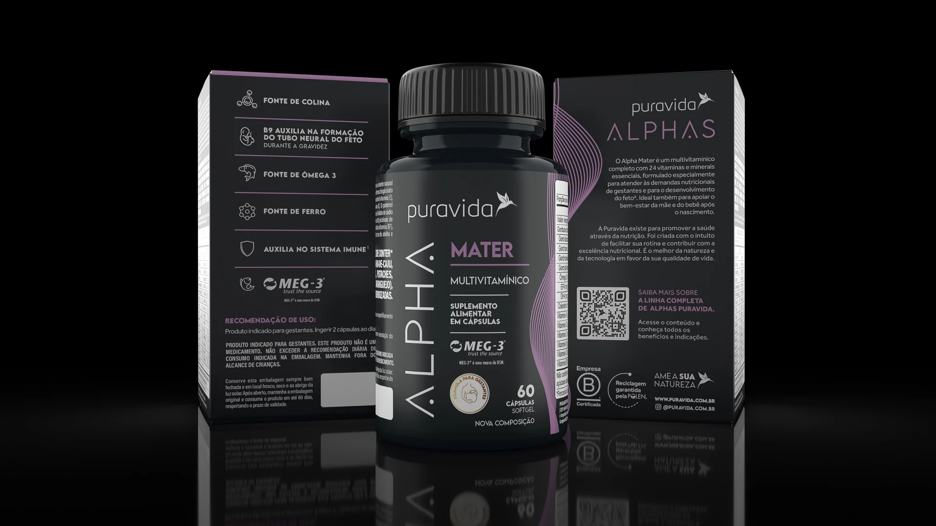
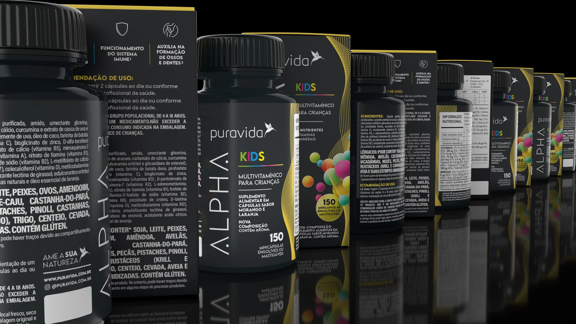
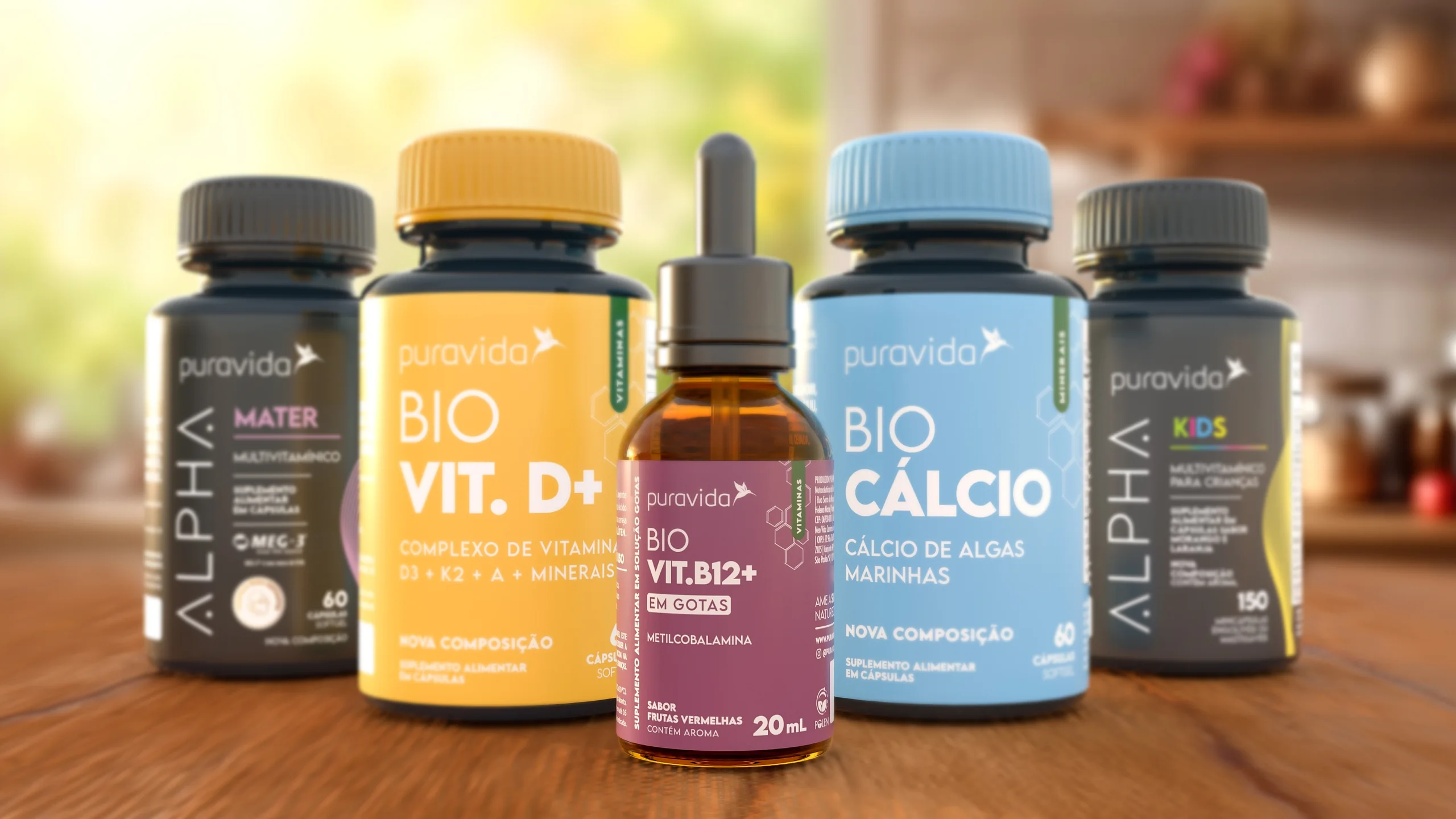
The complete multivitamin family is black across every SKU. What changes from one to the next is the audience (Mater for expectant mothers, Kids for children), and the audience name is the only element that comes in colour. Anyone who has bought one Alpha finds the next without reading the box.

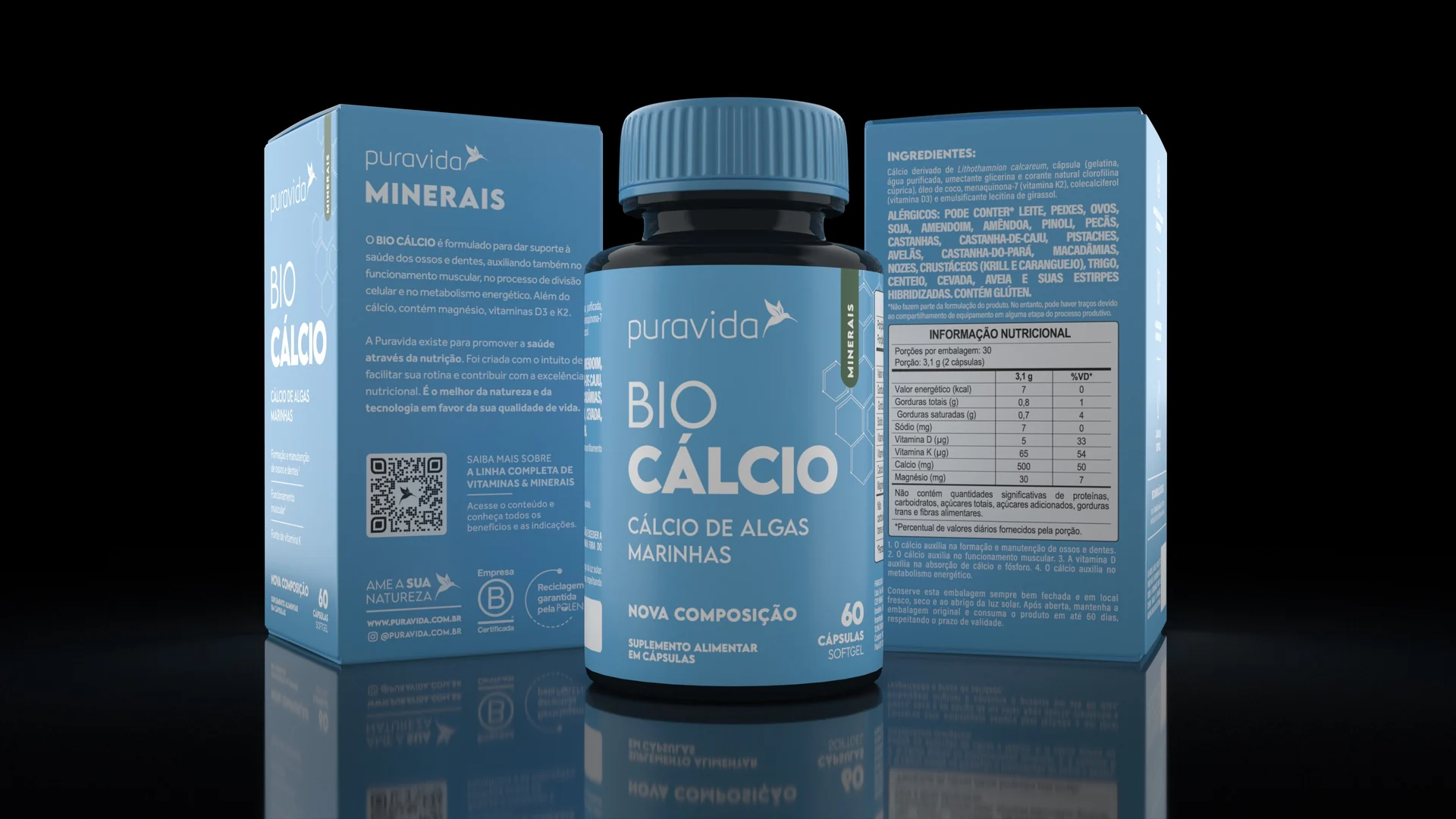
The single nutrient family works the other way round: the colour belongs to the nutrient, not the audience. Calcium blue, vitamin D yellow, B12 burgundy. On the pharmacy shelf, where the shopper is looking for a specific nutrient, colour arrives before the name.

Children's supplements are the only point in the line where illustration and full colour are justified: the child has to recognise it, and the parent has to trust it. The solution was to let colour in without leaving the black Alpha frame: the party happens inside the frame, not instead of it.

Bottle and cartons of Puravida Alpha Mater in black and lilac, with the benefit icons on the side panel. Bottle and cartons of Puravida Bio Cálcio in blue, with the green side band for the Minerals category and the nutrition table on the back panel. Row of Puravida Alpha Kids bottles and cartons in black, with the coloured sphere graphic and the Kids name in multicoloured letters.

The project in one line

A portfolio that had to look like one.

Puravida was selling dozens of supplements that had reached the shelf one at a time, each launch with its own logic. The job was to give the line an architecture: which family you are looking at, what changes from one bottle to the next, where colour decides and where it stays quiet. Then came the part nobody sees: reworking more than 150 SKUs for the 2023 ANVISA rules without breaking anything that had been built, in a team of three.

Five products from the Puravida line side by side on a kitchen counter: Alpha Mater and Alpha Kids in black, Bio Vit. D+ in yellow, Bio Vit. B12+ in burgundy and Bio Cálcio in blue.
3D imagery created and rendered by Hugo Zuffo

How it was done

The phases of the project.

Challenge

The portfolio had grown launch by launch, not as a system. In the pharmacy and in e-commerce, two products from the same brand could look like two different brands. ANVISA set a 2023 deadline for every brand to comply with the Regulatory Framework for Food Supplements.
Benchmark

Packs with dated design and heavy graphic effects had to be reworked: colours and typefaces, minimum size for mandatory information, and a nutrition table regulated by ANVISA.

Solution

The whole portfolio reviewed, updated and signed off by the nutrition regulatory team. More assurance and more consistency on the market.

Impact

Updating and bringing into compliance the entire portfolio of a brand with more than 400 SKUs, of which I handled more than 150.

The differentiator

The work nobody sees.

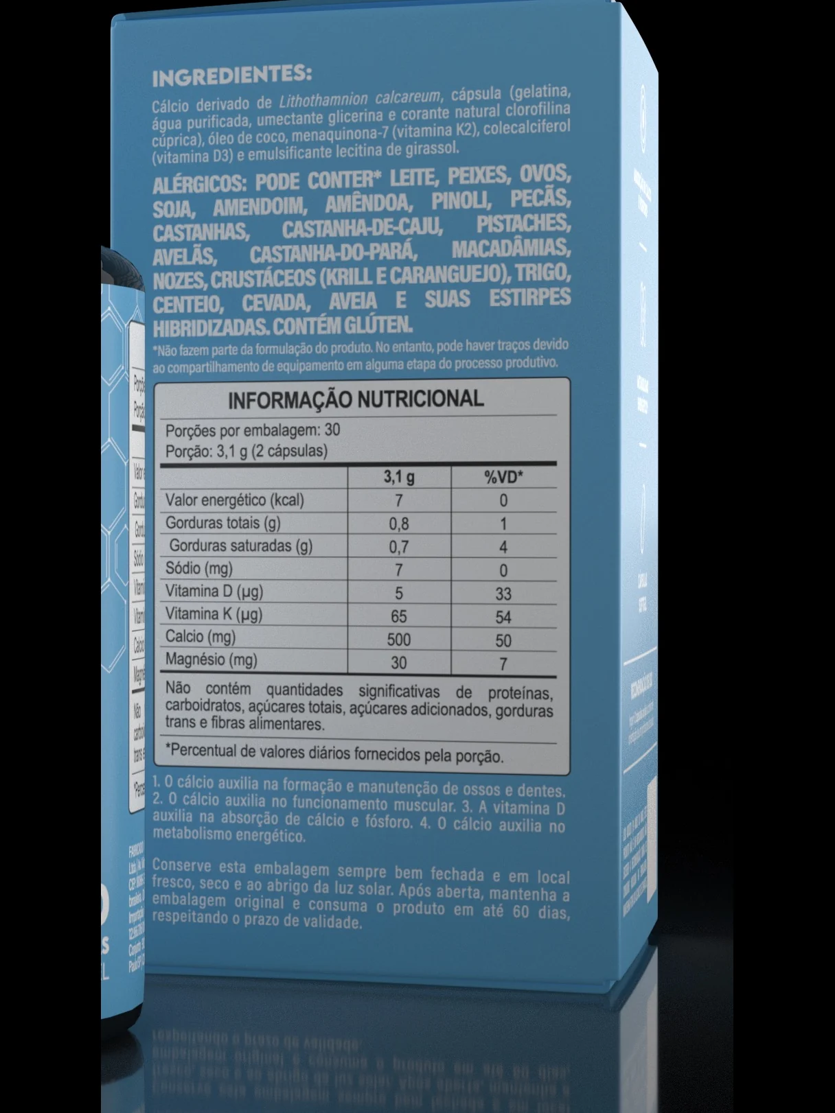
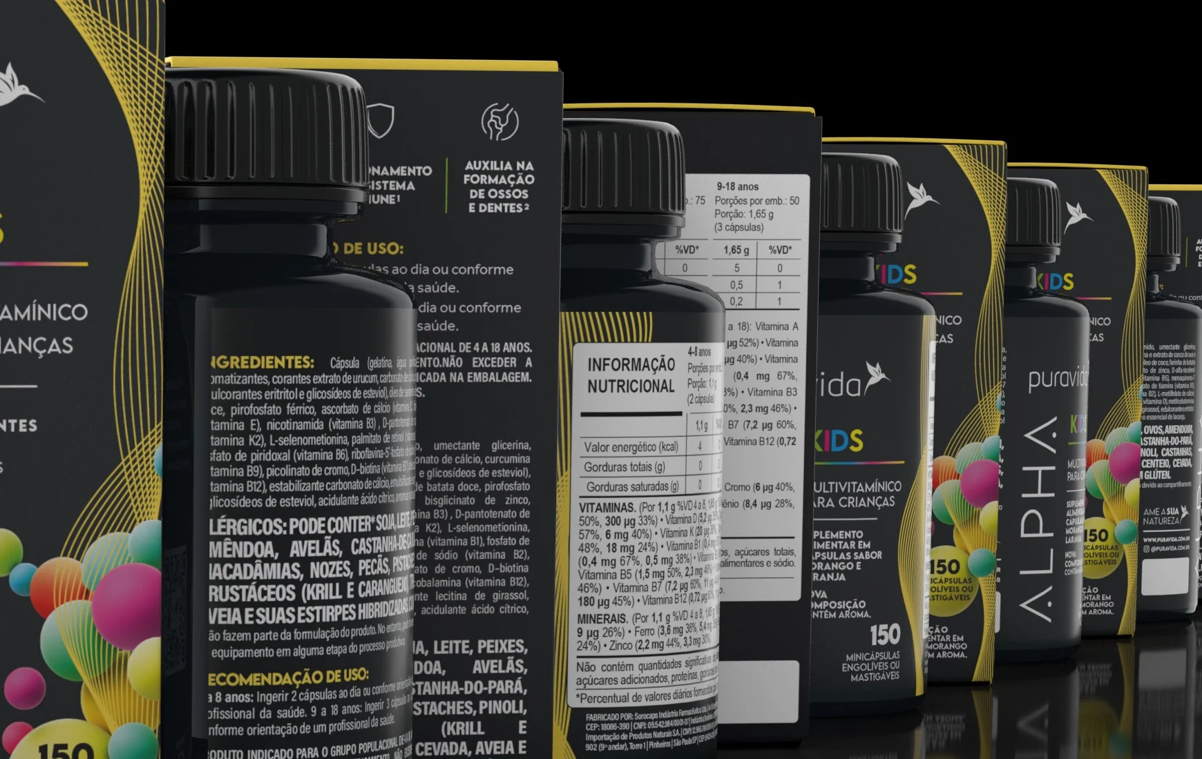
Ingredients, allergens, nutrition table, warnings: this is the most regulated panel of the pack and the one that costs the most when it comes back wrong from the printer. Here it was treated as information design and not as leftover space: the table, the allergen in capitals because the regulation demands prominence, and everything legible at the real size of the carton, not on screen.

More than 150 SKUs to bring into compliance, in a team of three. What makes that possible is not speed: it is having a rule that states what is fixed on every panel, what varies by SKU and where the variation is allowed to enter. Every product became a version of the same file, not a new file.

Back panel of the Bio Cálcio carton in detail: ingredient list, allergen warning in capitals and the nutrition information table. Row of Alpha Kids cartons and bottles receding in perspective, showing the same information panel repeated from SKU to SKU.